
Theming
A game's behaviour is its configuration and its look is its theme. Both are plain data, set the same way from every surface:
| Surface | Configuration | Theme |
|---|---|---|
| Script | define config.text_speed = 60 |
define theme.text_size = 40 |
| C# | game.SetConfig("text_speed", "60") |
game.SetTheme("text_size", "40") |
| Divooka, procedural | Set Config | Set Theme |
| Divooka, functional | With Config | With Theme |
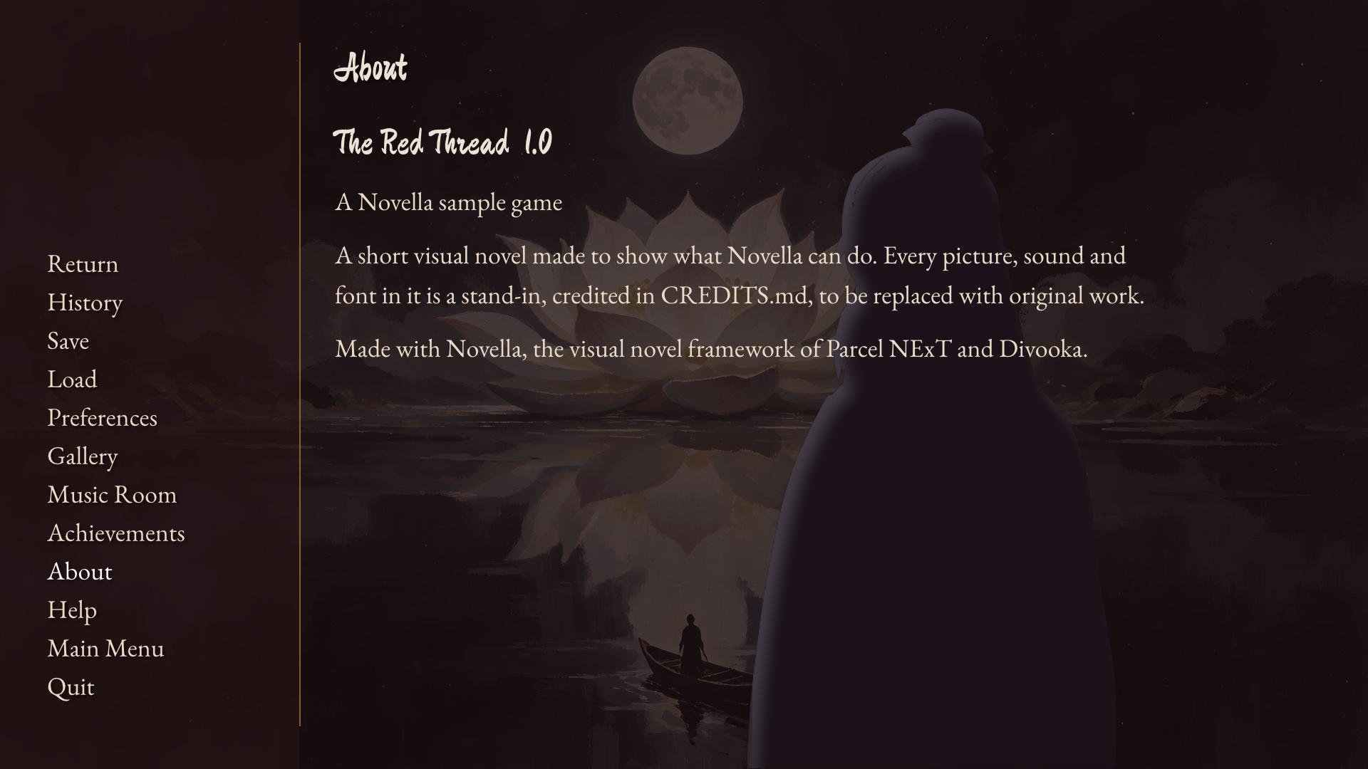
From C# and nodes, a value is written as a script would write it: a number, true or false, a list in brackets ([40, 40, 40, 40]), or text. A setting made from code (SetConfig, SetTheme, SetResolution and SetTitle, or the Set Config, Set Theme, With Config and With Theme nodes) holds over a script's define config. or define theme. of the same key, whichever comes first, so a program can load a game's scripts and then change one of their settings. The title and resolution given to the constructor are only defaults, which a script's define replaces. The lint warns about any key Novella does not know.
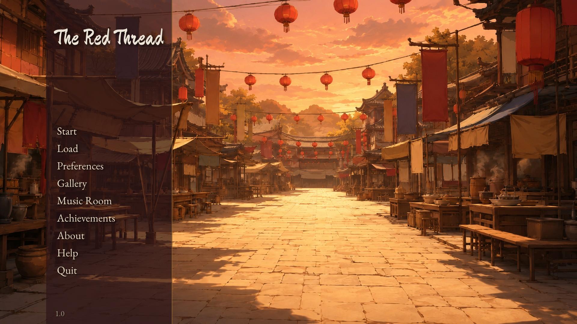
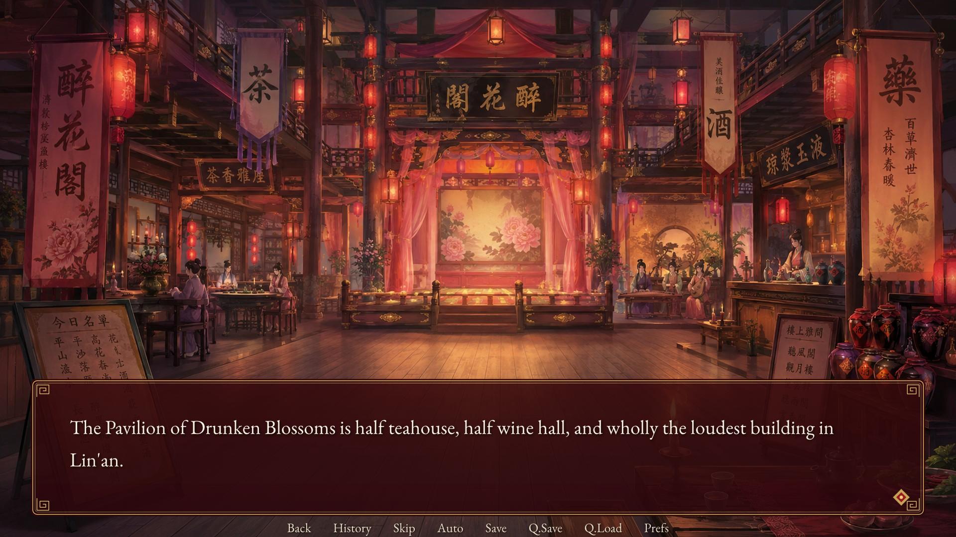
Everything in the theme is optional. Without images, the engine draws its dialogue window, name tab, choices and dialogs as panels in the theme's colours, which is what a game looks like before it has art.
Configuration
| Key | Default | Meaning |
|---|---|---|
title |
Novella Game |
The game's name: the window title and the main menu heading. |
version |
1.0 |
The version, shown on the main menu and in About, and stored in saves. |
developer |
Who made the game, shown in About. | |
about |
Text for the About screen. | |
id |
A short identifier for the save folder; empty uses the title with spaces and punctuation removed. | |
icon |
An image file for the window icon. | |
width, height |
1280, 720 |
The resolution everything is laid out at; the window scales it. |
start_label |
start |
The label Start runs. |
splash_label |
splashscreen |
A label run once at launch, before the main menu, if it exists. |
main_menu_label |
main_menu |
A label run instead of the built-in main menu, if it exists; when it returns, a new game starts. |
after_load_label |
after_load |
A label called after a save is loaded, if it exists. |
fall_through |
true |
Whether reaching the end of a label continues into the next label in the same file, rather than ending the game. |
rollback_limit |
100 |
How many steps the player can roll back. |
history_limit |
250 |
How many entries the history keeps. |
allow_rollback |
true |
Whether the player can roll back at all. |
rollback_past_choices |
true |
Whether rolling back may undo a menu choice and let the player choose again. |
text_speed |
40 |
The default typing speed, in characters per second; 0 shows text at once. |
auto_forward_delay |
2.0 |
The default wait, in seconds, after a line finishes before auto-forward advances (plus a little per character). |
skip_unseen |
false |
The default of the Unseen Text skip preference. |
skip_after_choices |
false |
The default of the After Choices skip preference. |
fullscreen |
false |
Whether a fresh install starts fullscreen. |
window |
auto |
The dialogue window's default visibility: auto (shown for dialogue, hidden otherwise), show or hide. |
auto_voice |
A voice file pattern such as voice/{id}.ogg; a line plays the file named by its id (or {character}, the speaker's voice tag) when it exists. |
|
main_menu_music |
Music played on the main menu. | |
start_transition |
fade |
The transition from the main menu into the game. |
after_load_transition |
dissolve |
The transition after loading a save. |
end_game_transition |
fade |
The transition back to the main menu when a game ends. |
original_language |
English |
The name of the script's own language, as the language preference lists it. |
default_language |
The language a fresh install starts in; empty for the original. | |
autosave |
true |
Whether the game saves to the autosave slots at menus and on quitting. |
autosave_slots |
6 |
How many autosave slots rotate. |
save_pages |
6 |
How many pages of save slots there are. |
slots_per_page |
6 |
How many save slots a page holds. |
show_quick_menu |
true |
Whether the quick menu (Back, History, Skip, Auto, Save, Q.Save, Q.Load, Prefs) shows under the dialogue window. Its short labels are explained on tooltips with their keys, such as Quick save (F5), and Back is dimmed when there is nothing to roll back to. |
confirm_quit |
true |
Whether quitting asks first. |
show_title_on_main_menu |
true |
Whether the main menu draws the title; turn it off when the background art carries it. |
developer_mode |
false |
The developer tools: Shift+O opens the console and Shift+R reloads the scripts. |
text_speed, auto_forward_delay, skip_unseen, skip_after_choices, fullscreen and default_language are the defaults of the player's preferences; once a player changes a preference, their choice is kept in the persistent data and wins.
Theme
Pixel sizes are written for a game 1080 pixels tall and are scaled by the game's height (or by scale, when it is set), so one theme fits every resolution. Colours are #rgb, #rrggbb or #rrggbbaa. Insets, margins and paddings are four numbers (left, top, right, bottom), two numbers (horizontal, vertical) or one number for all four sides.
Scale and fonts
| Key | Default | Meaning |
|---|---|---|
scale |
0 |
A multiplier for every pixel size; 0 scales by the game's height relative to 1080. |
font_files |
[] |
Font files among the assets, registered before the game starts so the families below can name them. |
text_font |
Font families for dialogue; empty uses the default stack. | |
name_font |
Font families for speaker names; empty uses interface_font. |
|
interface_font |
Font families for menus and buttons. | |
title_font |
Font families for the main menu title and screen headings; empty uses interface_font. |
|
text_size |
34 |
Dialogue text size. |
name_size |
36 |
Speaker name size. |
interface_size |
30 |
Menu and button text size. |
small_size |
22 |
Small text: the quick menu, slot details, notes. |
heading_size |
48 |
Screen headings (Save, Load, Preferences). |
title_size |
96 |
The main menu title. |
line_spacing |
1.25 |
Dialogue line height as a multiple of the font size. |
ruby_scale |
0.5 |
Ruby text size relative to its base. |
Colours
| Key | Default | Meaning |
|---|---|---|
text_color |
#f7f2e8 |
Dialogue. |
name_color |
#f2c879 |
Speaker names, for characters without their own colour. |
accent_color |
#d9a441 |
Selected items, slider fills, borders. |
interface_text_color |
#ebe4d6 |
Menu text. |
idle_color |
#d8cfbf |
Button text when idle. |
hover_color |
#ffd98a |
Button text under the pointer. |
selected_color |
#ffffff |
Button text when selected. |
insensitive_color |
#7d7568 |
Disabled button text. |
muted_color |
#a59c8c |
Secondary text. |
background_color |
#16121a |
Behind menus that have no background image. |
frame_color |
#120e14e8 |
Panels: slots, preference groups, dialogs. |
frame_border_color |
#d9a44166 |
Panel borders. |
text_outline_width |
0 |
An outline around dialogue text, in pixels, drawn behind the letters as a halo so it never thins them. |
text_outline_color |
#000000 |
The dialogue outline's colour. |
text_shadow |
true |
Whether dialogue casts a soft shadow, which keeps it legible over any background. |
text_shadow_color |
#000000b0 |
The shadow's colour. |
The dialogue window
| Key | Default | Meaning |
|---|---|---|
textbox_image |
An image for the dialogue window, stretched as a nine-patch; empty draws a panel. | |
textbox_borders |
[40, 40, 40, 40] |
The image's nine-patch insets, in image pixels. |
textbox_color |
#0f0b12d0 |
The drawn panel's fill. |
textbox_border_color |
#d9a44188 |
The drawn panel's border. |
textbox_corner_radius |
14 |
The drawn panel's corner radius. |
textbox_height |
270 |
The window's height. |
textbox_margin |
[60, 0, 60, 30] |
Space between the window and the screen's edges. |
textbox_padding |
[70, 62, 70, 30] |
Space between the window's edge and its text. |
namebox_image |
An image behind the speaker's name (nine-patch); empty draws a tab. | |
namebox_borders |
[20, 10, 20, 10] |
The name image's nine-patch insets. |
namebox_color |
#2a1a1ce8 |
The drawn name tab's fill. |
namebox_offset |
[50, -26] |
Where the name sits relative to the window's top-left corner. |
namebox_padding |
[26, 8, 26, 8] |
Space around the name inside its tab. |
side_image_width |
300 |
The width kept for side images inside the window. |
ctc_image |
A click-to-continue indicator; empty draws a small arrow. Either floats gently while the game waits for a click. |
Choices
| Key | Default | Meaning |
|---|---|---|
choice_image |
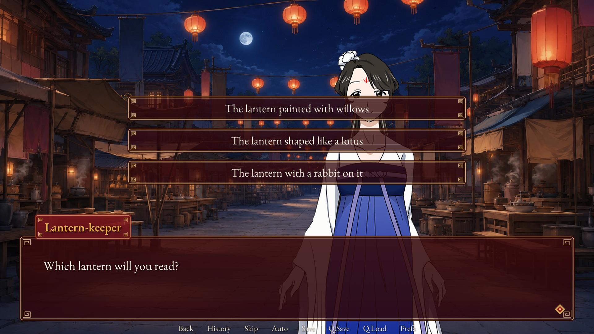
An image behind each menu choice (nine-patch); empty draws a panel. | |
choice_hover_image |
The choice image under the pointer. | |
choice_borders |
[30, 12, 30, 12] |
The choice images' nine-patch insets. |
choice_width |
1100 |
Choice button width. |
choice_height |
76 |
Choice button height. |
choice_spacing |
20 |
Space between choices. |
choice_color |
#140f14e0 |
The drawn choice fill. |
choice_hover_color |
#4a2a1ef0 |
The drawn choice fill under the pointer. |
choice_center_y |
0.42 |
The vertical centre of the choice list, as a fraction of the screen. |
Menus
| Key | Default | Meaning |
|---|---|---|
button_image |
An image behind menu buttons (nine-patch); empty draws text-only buttons. | |
button_hover_image |
The menu button image under the pointer. | |
button_borders |
[20, 10, 20, 10] |
The button images' nine-patch insets. |
main_menu_background |
An image name or file for the main menu; empty draws a gradient. | |
game_menu_background |
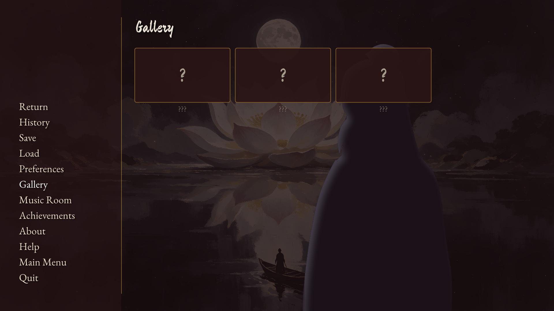
An image name or file behind Save, Load, Preferences and the rest; empty dims the game. | |
main_menu_xalign |
0.08 |
Where the main menu's buttons sit horizontally. |
main_menu_yalign |
0.86 |
Where the main menu's buttons sit vertically (their bottom). |
main_menu_panel |
true |
Whether a translucent panel sits behind the main menu's buttons. |
logo_image |
An image drawn above the main menu's buttons instead of the title text. | |
frame_image |
An image behind dialogs such as confirmations, stretched as a nine-patch with the textbox's insets; empty draws a panel. | |
hover_sound |
A sound played when the pointer enters a button. | |
click_sound |
A sound played when a button is pressed. | |
notify_color |
#120e14ee |
Notification fill. |
nvl_background |
#000000b8 |
The NVL page's backdrop. |
nvl_text_size |
32 |
NVL text size. |
menu_transition_time |
0.25 |
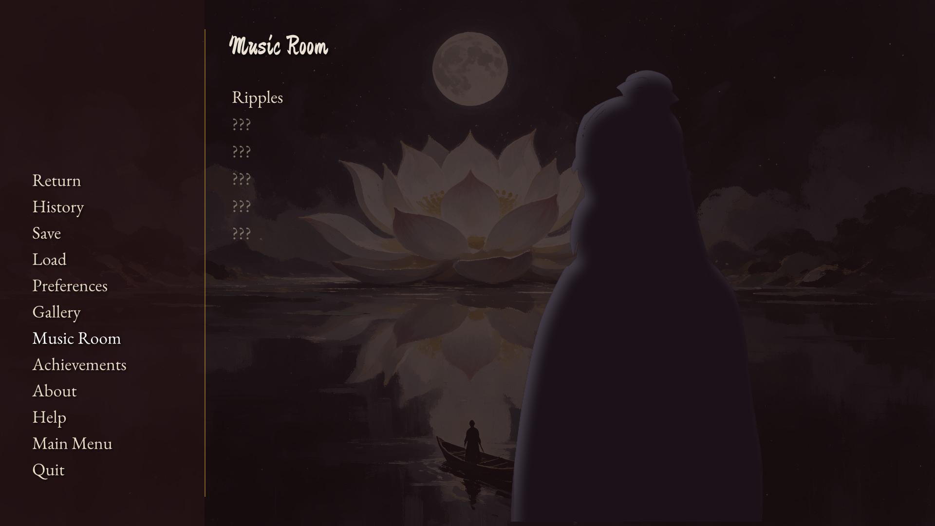
How long menus take to fade in. |
Theme settings and styles
Every screen Novella draws for itself draws with named styles, and those styles are made from the theme. A theme setting is therefore a shorthand for a property of one or more of the built-in styles:
| Theme settings | Become |
|---|---|
text_font, text_size, text_color, line_spacing, text_outline_width, text_outline_color, text_shadow, text_shadow_color |
say_dialogue's font, size, color, line_spacing, outline and shadow; the NVL page, centered text and the history inherit them. |
name_font, name_size, name_color |
say_label's font, size and color. |
interface_font, interface_size, interface_text_color, accent_color |
default, the root every style inherits from. |
idle_color, hover_color, selected_color, insensitive_color, muted_color |
button_text's color and its hover_, selected_, insensitive_ and visited_ variants. |
textbox_image or textbox_color, textbox_borders, textbox_border_color, textbox_corner_radius, textbox_padding, textbox_margin, textbox_height |
say_window's background, borders, border_color, corner_radius, padding, margin and ysize. |
namebox_image or namebox_color, namebox_borders, namebox_padding, namebox_offset |
namebox's background, borders, padding, xoffset and yoffset. |
choice_image, choice_hover_image, choice_color, choice_hover_color, choice_borders, choice_width, choice_height, choice_spacing |
choice_button's background, hover_background, borders, xsize, ysize and spacing. |
button_image, button_hover_image, button_borders |
menu_button's background, hover_background and borders; button_image and button_borders also give button, on a game's own screens, its picture. |
frame_image or frame_color, frame_border_color |
frame and the panels: save_slot, tooltip, confirm_frame, game_menu_navigation and the rest. |
hover_sound, click_sound |
Every button style's hover_sound and activate_sound. |
title_font, title_size, heading_size |
main_menu_title and game_menu_title. |
side_image_width, ctc_image, nvl_background, nvl_text_size, notify_color, background_color |
side_image, ctc, nvl_window, nvl_dialogue, notify_frame and game_menu. |
A story's style of the same name is laid over the one the theme made, so it refines rather than replaces it: define theme.text_color = "#fff4d0" and a style say_dialogue: block setting color "#fff4d0" say the same thing, and a style say_window: that sets only background keeps the window's height, margin and padding from the theme. A game that sets no style looks exactly as the theme alone makes it. Some settings have no style behind them, because they say where things go or how the game behaves rather than how something looks: scale, font_files, choice_center_y, main_menu_xalign, main_menu_yalign, main_menu_panel, main_menu_background, game_menu_background, logo_image and menu_transition_time.
Use the theme for a game's overall look, and Styles for what its keys cannot say: one character's window, name or text; a choice's hover border, or the colour of a choice taken before; a frame with rounder corners than the rest; a look for one button of a screen; one word of a line in another colour. The Built-in Style Names node lists every style a story can restyle.
Fonts
Font settings take a family list: names separated by commas, tried in order for each character, so a Latin face can come first and a Chinese or Japanese face fill in the characters it lacks. The engine's default stack always follows the list: Noto Sans, Segoe UI, Helvetica Neue and Arial for Latin text, then Noto Sans CJK, Source Han Sans, Microsoft YaHei, PingFang SC, Yu Gothic UI, Hiragino Sans, Malgun Gothic, SimSun and DejaVu Sans, so Chinese, Japanese and Korean text renders out of the box on a machine that has any of them.
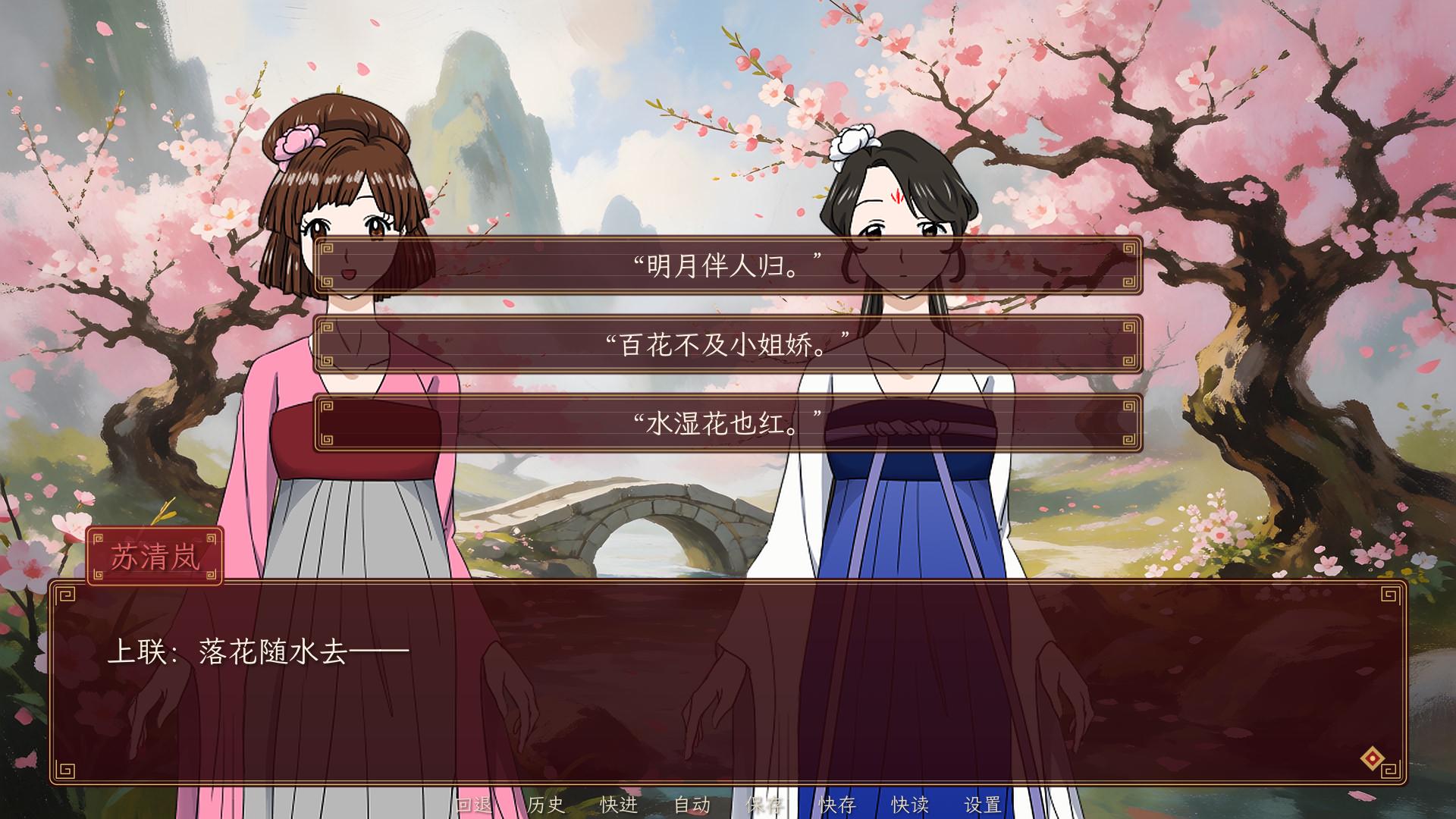
To ship fonts with the game, put the files among its assets, list them in font_files, and name their families:
define theme.font_files = ["fonts/EBGaramond-Regular.ttf", "fonts/EBGaramond-Italic.ttf", "fonts/EBGaramond-SemiBold.ttf", "fonts/LXGWWenKaiLite-Regular.ttf", "fonts/MaShanZheng-Regular.ttf"]
define theme.text_font = "EB Garamond, LXGW WenKai Lite"
define theme.name_font = "EB Garamond, LXGW WenKai Lite"
define theme.interface_font = "EB Garamond, LXGW WenKai Lite"
define theme.title_font = "Ma Shan Zheng, LXGW WenKai Lite"
.ttf, .otf and .ttc files are recognised. Register the italic and bold files of a family too, so {i} and {b} use real faces. A character can have its own font (character q "Qinglan" font "Ma Shan Zheng"), and a run of text can switch with {font=Family}. Ruby text above CJK characters is sized by ruby_scale. Use openly licensed fonts (SIL Open Font License or Apache) and ship each font's licence with the game.
Nine-patch images
The dialogue window, the name tab, choices, menu buttons and dialogs can each be an image stretched as a nine-patch: the image is cut into a 3×3 grid by four insets, the corners are drawn at their own size, the edges stretch along their length, and the centre stretches both ways. A small image with decorated corners therefore fills any size without distorting them.
define theme.textbox_image = "gui/textbox.png"
define theme.textbox_borders = [48, 48, 48, 48]
define theme.textbox_height = 280
define theme.textbox_padding = [80, 66, 80, 34]
define theme.choice_image = "gui/choice_idle.png"
define theme.choice_hover_image = "gui/choice_hover.png"
define theme.choice_borders = [28, 28, 28, 28]
Insets are measured in the image's own pixels and are not scaled; they say where the corners end. Margins, paddings and sizes are in game pixels and are scaled with the game. To prepare an image, keep everything that must not stretch (ornaments, rounded corners) inside the corner regions, and make the edge and centre regions plain enough to stretch. Edges are stretched, not tiled.
| Image | Insets |
|---|---|
textbox_image |
textbox_borders |
namebox_image |
namebox_borders |
choice_image, choice_hover_image |
choice_borders |
button_image, button_hover_image |
button_borders |
frame_image |
textbox_borders |
Preferences
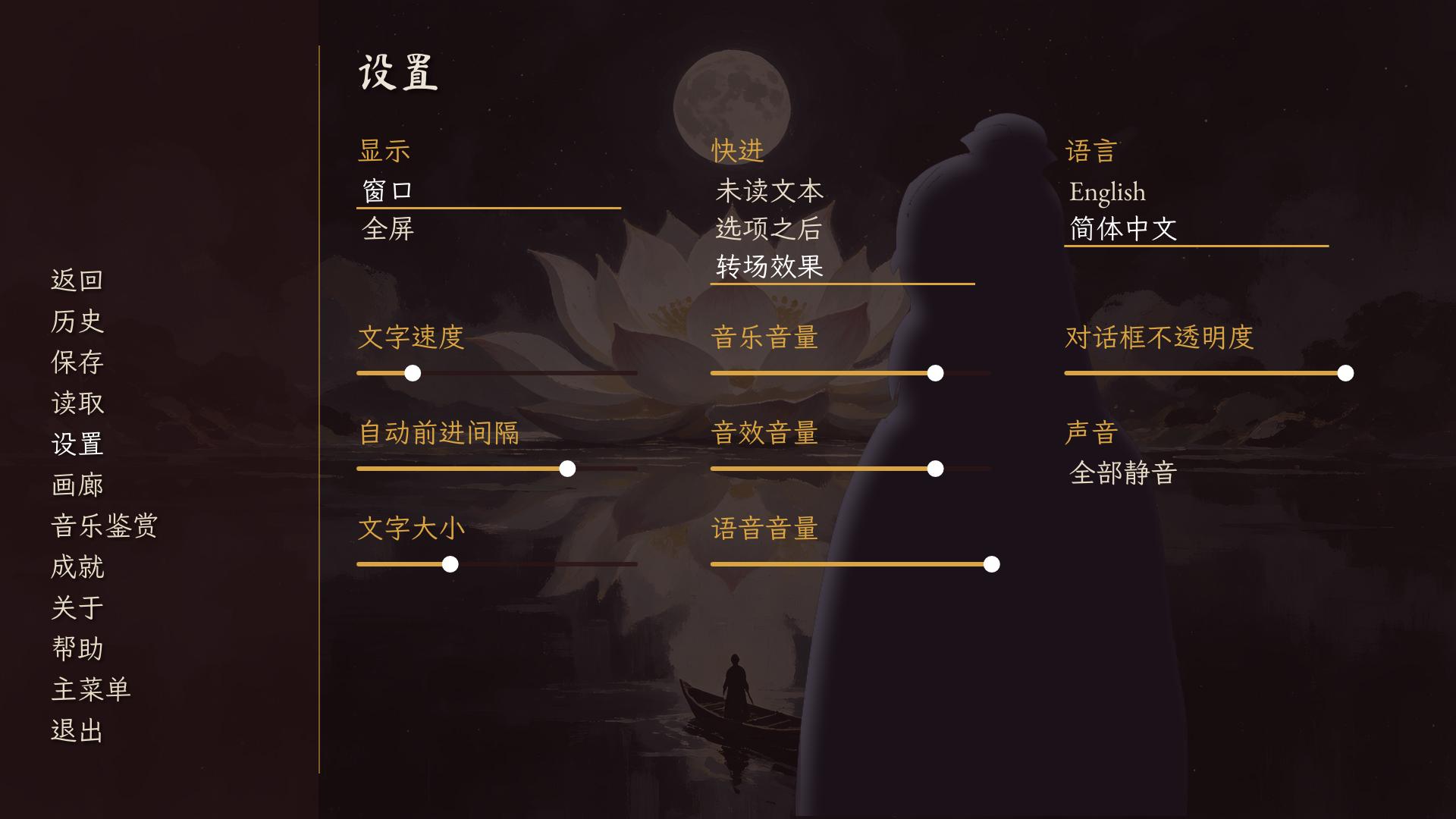
The Preferences screen offers the player: Display (Window or Fullscreen), Skip (Unseen Text, After Choices, Transitions), Language (when the story has translations), Text Speed, Auto-Forward Time, Text Size, Music Volume, Sound Volume, Voice Volume, Window Opacity and Mute All. Preferences are kept in the persistent data, never in saves.
Interface translations
The engine's own words (main menu, game menu, preferences, save slots, confirmations, notifications, the help screen) are built in for three languages beyond English:
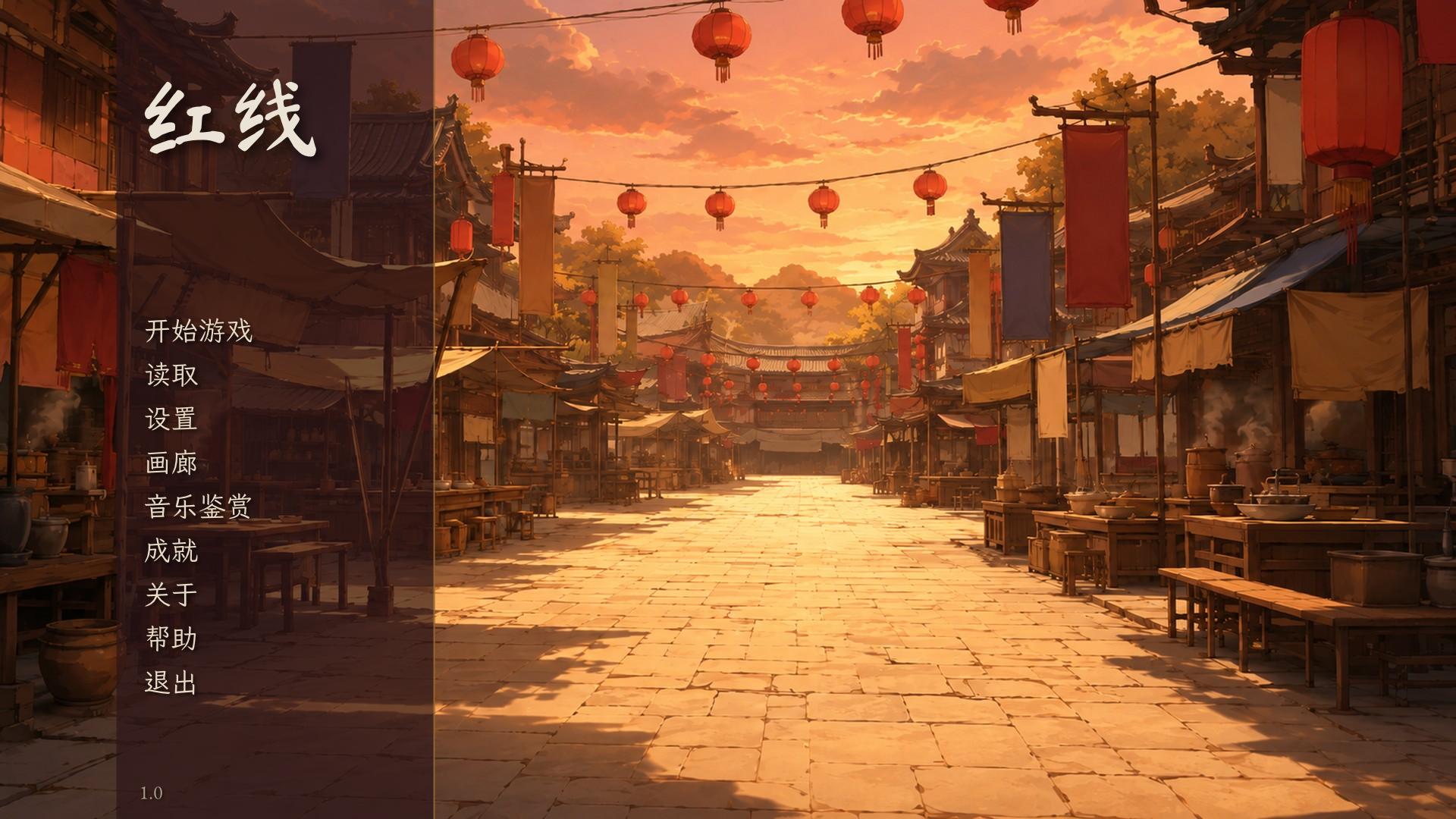
| Language | Codes that select it | Coverage |
|---|---|---|
| Simplified Chinese | zh, zh-Hans, zh-CN and any other zh- code not listed below, schinese, chinese, simplified chinese |
Every interface word, message and help line. |
| Traditional Chinese | zh-Hant, zh-TW, zh-HK, tchinese, traditional chinese |
Menus, preferences, the quick menu and its tooltips, confirmations and the common notifications. |
| Japanese | ja, ja-JP and other ja codes, japanese |
Menus, preferences, the quick menu and its tooltips, and the most common messages. |
Codes are matched without regard to case, with _ and - alike. Words without a translation show in English. The built-in words apply when the player's language is one of these, and the language picker lists the languages the story translates, so a game gets them by translating its own text into that language (or by setting config.default_language).
A story's own string translations come first, so a game can replace any engine word, in any language, including one Novella has no table for:
translate zh-Hans strings:
    old "Start"
    new "开篇"
    old "Quit"
    new "归去"

translate ko strings:
    old "Start"
    new "시작"
The language picker shows a language by its own name for the codes it knows (简体中文, 繁體中文, 日本語, 한국어, English, Français, Deutsch, Español, Русский) and by its code otherwise.