
Colour management
This is the one genuinely technical page in the guide, and it is here because getting colour management wrong ruins pictures quietly. Nothing reports an error. The file is not damaged. Only the reading of it is wrong, and you find out when you print it or send it to somebody.
Twenty minutes here will save you a batch of prints.
The problem
A pixel in a file is three numbers. Red 200, green 60, blue 40.
Those numbers do not name a colour. They are an instruction — "give me 200 units of your red" — and what comes out depends entirely on what "your red" means. A cheap monitor, a wide-gamut monitor and a sheet of paper answer that differently, so the same three numbers are three different colours.
A colour profile is the missing half of the message. It says what the numbers mean, by describing exactly which red, green and blue this file was written against. With a profile, 200/60/40 is a specific colour that any device can try to reproduce. Without one, it is a guess.
Working spaces
A working space is the profile your document is edited in.
| Space | Covers | Use it when |
|---|---|---|
| sRGB | The smallest range | Anything for a screen, the web, or general use. The safe default. |
| Adobe RGB (1998) | Wider, especially in greens and cyans | Preparing work for print |
| Display P3 | Wider than sRGB, matches modern displays | Modern Apple hardware and displays |
| ProPhoto RGB | Enormous — wider than the eye | Editing raw files where you want headroom |
sRGB unless you have a reason. It is what browsers assume, what most screens can show, and what anybody you send a file to will treat it as. A wider working space can retain colours for later use, but output still needs a deliberate conversion for its destination. A display’s limited gamut need not discard data in the working file.
The trade with the wider spaces is precision. The same three numbers must stretch across a bigger range, so each step is a bigger jump, and in an 8-bit file that can show as banding in gradients.
What happens when you open a file
Two cases, and they are the whole of it.
The file has a profile
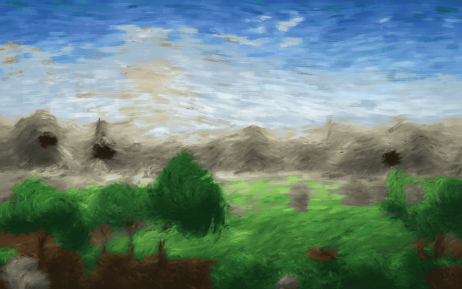
The colours are converted from the file's space into your working space, so that they look the same. The numbers change; the conversion aims to preserve appearance within the destination gamut. This is what you want, and it happens automatically.
| Managed correctly | Read without managing |
|---|---|
 |
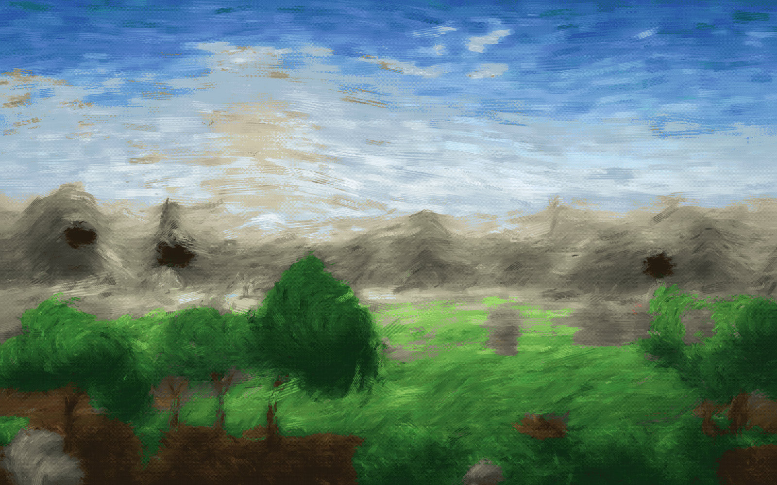 |
The difference is exactly what the setting's own description warns about: an Adobe RGB or ProPhoto image read without its profile opens with every saturated colour in the wrong place. Skies go flat, greens go grey, and nothing tells you.
The file has no profile
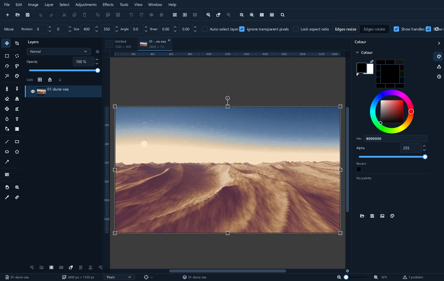
Then there is nothing to convert from, and the editor has to assume something. It assumes the working space, and it says so in the status bar:
The file carries no colour profile; its numbers are read as sRGB IEC61966-2.1, which is the working space, so nothing was converted.
That message is not a complaint. It is telling you a guess has been made. For a file that really is sRGB — most JPEGs from most places — the guess is right and nothing is lost.
For a file that is not, the guess is wrong, and it looks wrong.
Assuming versus converting
If you know an untagged file's real space, there are two different things you might do, and they are not the same:
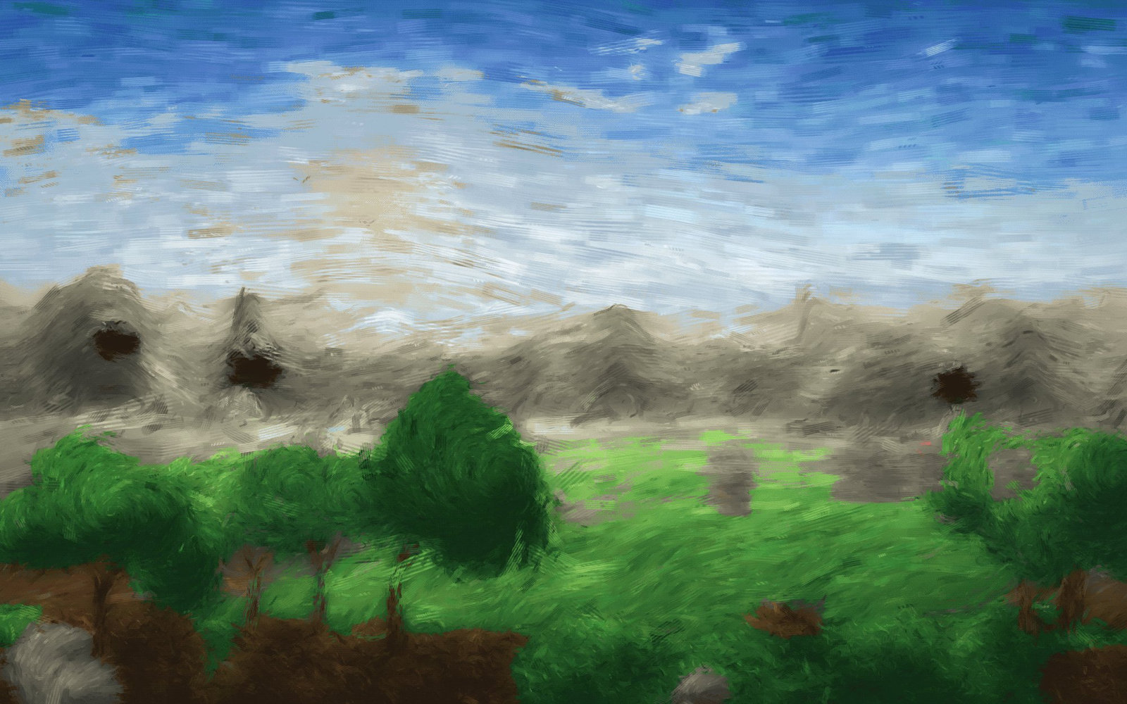
- Assume it is ProPhoto — tell the editor that is what the numbers already mean. The numbers stay; the appearance changes, because they are now being interpreted correctly.
- Convert it to ProPhoto — treat it as it currently is and translate. The numbers change; the appearance stays.
| Assumed to be ProPhoto | Converted to ProPhoto |
|---|---|
 |
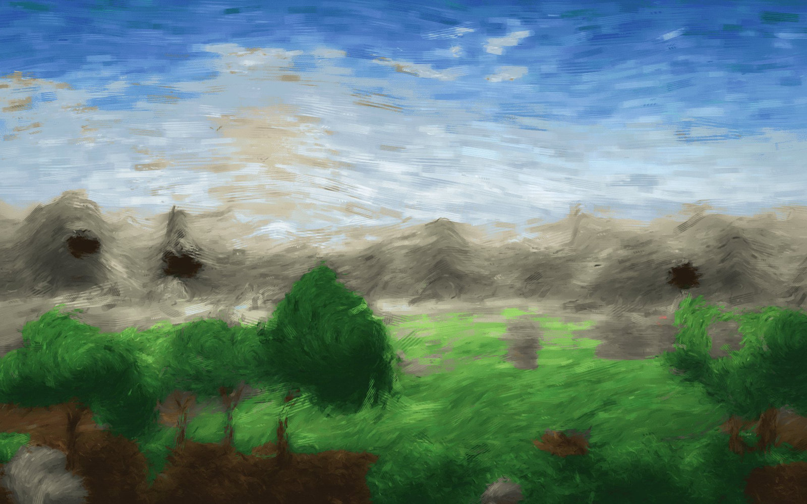 |
Assume when the file was mislabelled. Convert when it was labelled correctly and you want it somewhere else.
The settings
They live in Tools ▸ Options ▸ Colour management.
Working space
Which profile your documents are edited in. sRGB unless you have a specific reason.
Convert an opened image into the working space
Leave this on. It is what makes a tagged file look right.
The setting's own note puts the case for it plainly: a photograph carries a profile saying what its numbers mean, and read without it, an Adobe RGB or ProPhoto image opens with every saturated colour in the wrong place. Turning it off takes every image's numbers at face value and shows them unconverted — occasionally useful for inspecting a file, wrong for editing one.
Images with no profile
What to assume when a file says nothing. Reading them as the working space is the sensible default.
Rendering intent
When a colour exists in one space and not in another — a saturated green that a printer cannot make — something has to give. The rendering intent is the policy for what.
| Intent | What it does | Use it for |
|---|---|---|
| Perceptual | Compresses the whole range so relationships between colours are kept | Photographs |
| Relative colorimetric | Keeps in-range colours exactly and clips the rest | Most work, and the usual default |
| Saturation | Keeps colours vivid at the expense of accuracy | Charts and diagrams |
| Absolute colorimetric | Keeps colours exactly, including the white point | Proofing one printer on another |
For photographs the argument is between the first two, and the honest answer is to try both on the picture in front of you. Perceptual is gentler when a lot of colour is out of range; relative colorimetric is more accurate when little of it is.
Saving with a profile
When you export, the profile can be written into the file. Do it. An untagged JPEG on the web is assumed to be sRGB by every browser, so if your file is anything else it will be shown wrongly, and there is nothing the viewer can do about it.
Profile size varies; it is usually a small part of a photographic file.
File ▸ Export ▸ Color profile... writes the profile out on its own, for when somebody needs the profile rather than the picture.
Practical advice
Work in sRGB and export in sRGB unless you have a reason not to. This is right for almost everybody almost always, and it is right precisely because it is what everything else assumes.
Always embed the profile on export. It costs nothing and prevents the commonest failure.
If a picture looks different in another program, check three things in order: whether the file has a profile at all, what that profile is, and whether the other program is managing colour. One of those three is the answer nearly every time.
If colours look flat or oversaturated on opening, look at the status bar. It will have told you what it assumed.
For print, ask the printer what they want. Many want sRGB; some want Adobe RGB; a few supply their own profile for the paper. Converting once, at the end, to what they asked for is better than guessing early.
Wide-gamut screens show sRGB images oversaturated unless the system is managing colour. If your pictures look punchy on your machine and flat everywhere else, that is usually the cause — and the pictures are fine.
Sample
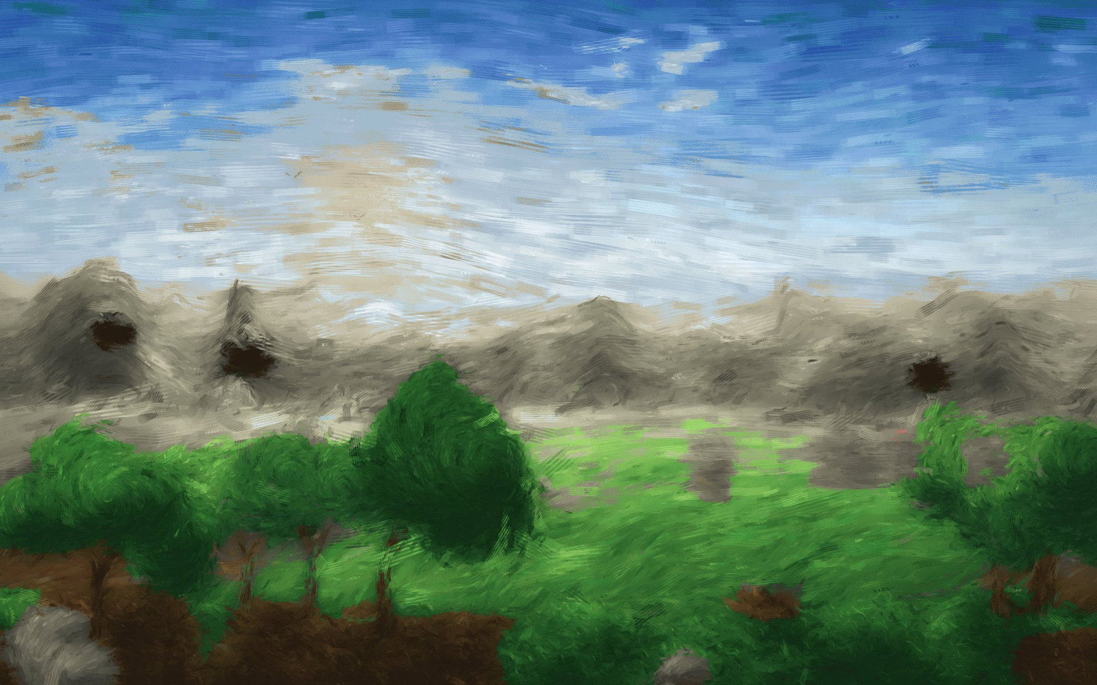
The same picture in two spaces, so you can see what a profile mismatch looks like when it goes wrong somewhere in the chain:
| sRGB | Adobe RGB (1998) |
|---|---|
 |
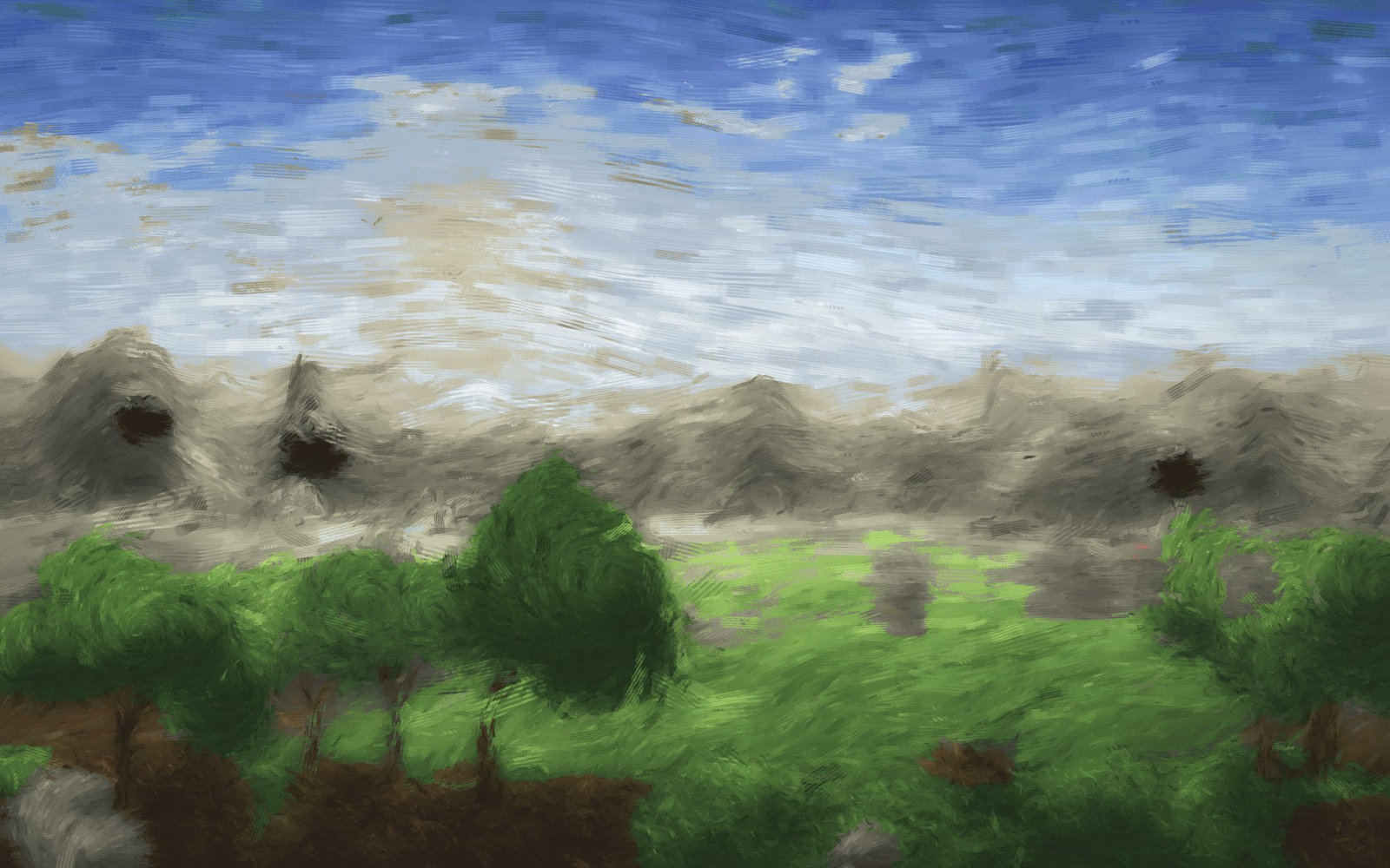 |
If your browser manages colour, these look nearly identical — which is the system working. If the second looks flat and grey, your browser is ignoring the profile, and that is exactly the failure this page is about.
Gamut is not bit depth
A wider gamut can retain saturated colours for later processing even when the current display cannot show all of them. At delivery, convert deliberately for the destination; a wider space does not automatically improve a print. Use the printer or service's specified workflow and keep the profile embedded when the output format supports it.
Bit depth controls numerical precision. It does not enlarge the gamut or guarantee preserved highlight range throughout editing. Avoid converting an image to a wider space merely to make its colours seem richer: assigning the wrong interpretation changes appearance without restoring missing colour information. Image basics explains these distinctions with examples.
Next
- Opening and saving — embedding a profile on export
- Camera raw — where the working space choice matters most
- Adjustments — correcting colour once it is read correctly