
Styles
A style is a named look: a set of properties for text and for boxes, such as a font, a colour, a background and a padding, with a parent it inherits whatever it does not set itself. Every part of a Novella game is drawn with one: the dialogue window and its text, the name tab, the choices, the quick menu, the save slots, the buttons and frames of a game's own screens. A story restyles any of them by defining a style of the same name, and makes looks of its own for its screens, its characters and single words of a line.
Styles work the way they do in Ren'Py, so a Ren'Py writer will recognise them; the differences are listed at the end. Theming remains the quickest way to set a game's look, because each theme setting is a shorthand for a property of one of the built-in styles; styles are for everything the theme keys cannot say.
style gold_button is button:
    background "gui/gold_idle.png"
    hover_background "gui/gold_hover.png"
    borders (24, 24, 24, 24)
    padding (32, 12)

style gold_button_text is button_text:
    font "Ma Shan Zheng"
    size 40
    color "#e8dcc6"
    hover_color "#ffd27a"
    insensitive_color "#7d7568"

style say_dialogue:
    outline_width 2
    outline_color "#1a0f0a"

style ghost_window is say_window:
    background "#10202cd0"

style shout:
    color "#ff6050"
    bold true

character ghost "Ghost" window_style "ghost_window" what_size 40
Defining a style
style name [is parent]: sits at a script's top level, with one property per line in the block under it. Several properties may share a line (padding (32, 12) text_align center).
- The parent is the style a property comes from when this one does not set it.
style gold_button is button:starts from everything abuttonalready is and changes only what it lists. A style with no parent inherits fromdefault, the root of every style, which holds the interface font, size and colour. - A second definition adds to the first. Writing
style title:again later, in the same file or another, sets more properties on the same style, and where both set one, the later wins. A later definition withischanges the parent; one without keeps it. - A style named like a built-in one restyles that part of the game.
style say_dialogue:is not a new style but more properties laid over Novella's ownsay_dialogue, which is what every line of dialogue is drawn with (see The built-in styles).
Values are written as a script writes them: colours as "#rrggbb" or "#rrggbbaa" (also "#rgb"), numbers, true and false, quoted text for fonts and files, bare words such as center, bold and none, and edges in brackets. Sizes are in pixels for a game 1080 pixels tall and scale with the game, as the theme's do. Edges are (left, top, right, bottom); two numbers are left-right and top-bottom, and one number is all four sides.
Styles are definitions, not game state: they are not saved, so a game loaded from an old save draws with the styles the scripts define now. With developer mode on, Shift+R reloads the scripts and applies changed styles at once.
States
An element is in one or more states, and a property can be given for one of them by prefixing its name:
| Prefix | The element is |
|---|---|
idle_ |
In none of the states below. |
hover_ |
Under the pointer, or holding the keyboard's or gamepad's focus. |
selected_ |
Chosen: the current tab of a menu, an option that is on, an earned achievement. |
insensitive_ |
Not pressable, such as a button whose sensitive condition is false. |
visited_ |
Taken before: a menu choice chosen in an earlier playthrough. |
hover_color "#ffd27a" colours a button's text under the pointer, and hover_background "gui/gold_hover.png" swaps its picture. Any property takes any prefix. hover_sound is not a sound for the hover state but a property of its own: the sound played when the pointer arrives.
How a property is found
A property is looked up along the style and then its parents. At each style in turn:
- a state-prefixed property for one of the element's states wins, the states tried in the order insensitive, selected, hover, visited (an element in none of them is idle);
- otherwise the plain property;
- only when the style has neither is its parent asked.
So a style that sets a plain property covers every state of it, and a parent's state variants are not reached through it:
style base_text is text:
    color "#111111"
    hover_color "#222222"
    selected_color "#333333"

style plain_text is base_text:
    color "#444444"
Under the pointer, base_text is #222222, and selected and under the pointer it is #333333, because selected is tried before hover. plain_text is #444444 in every state: it sets color itself, so the lookup stops there before reaching its parent's hover_color. Its text_align it sets nowhere, so that comes from further up, from text. This is Ren'Py's rule, and it is what a style that sets a colour expects.
Properties
| Group | Property | Value |
|---|---|---|
| Text | font |
Font families, separated by commas, in a string; the first that has a character draws it, as in the theme's font lists. |
size |
The text's size. | |
color |
The text's colour. | |
bold |
true or false. |
|
weight |
normal, medium, semibold or bold. |
|
line_spacing |
Line height as a multiple of the text's size. | |
text_align |
left, center or right. |
|
outline_width, outline_color |
An outline around the text, drawn behind the letters. | |
shadow, shadow_color, shadow_offset |
A soft shadow, its colour, and how far it falls (unset, it follows the text's size). | |
ruby_scale |
Ruby text's size relative to the text it annotates. | |
| Box | background |
What the box is drawn on: a colour; an image name or a file, stretched as a nine-patch by borders; or none. |
borders |
A background image's nine-patch corners, (left, top, right, bottom) in the image's own pixels: corners kept, edges and middle stretched (see nine-patch images). |
|
border_color, border_width |
The outline of a box drawn in a colour, and its width. | |
corner_radius |
The rounding of a box drawn in a colour. | |
accent_color |
Small marks: the bar under a selected tab, a slider's fill, a text field's caret, the click-to-continue arrow. | |
image |
A picture the element draws, such as the click-to-continue mark (ctc). |
|
| Layout | padding |
Space between a box's edge and what it holds. |
margin |
Space around a box, between it and the screen's edges. | |
xsize, ysize |
A box's width and height. | |
spacing |
Space between the things a box holds, one after another. | |
xoffset, yoffset |
A shift across and down from where the box would be. | |
| Sound | hover_sound |
Played when the pointer comes onto a button. |
activate_sound |
Played when a button is pressed. |
Not every property means something to every element: a text has no background, and a vbox has no font. A property an element does not use is simply not read; a name that is no property at all is reported by the validator.
An outline is drawn behind the letters, all of its width outside them, as a halo: thin light text with a dark outline keeps its own colour and shape. The same goes for the theme's text_outline_width and for the {outlinecolor} text tag, which draws at least two pixels of outline.
The built-in styles
Everything Novella draws for itself draws with one of its own styles, and those styles are made from the theme. So define theme.text_color = "#fff4d0" and
style say_dialogue:
    color "#fff4d0"
say the same thing. A theme key is a shorthand for a property of a built-in style; a story's style of the same name is laid over the one the theme made, so it refines rather than replaces it. style say_window: with a new background keeps the window's height, margins and padding from the theme, and style say_dialogue: with an outline keeps the dialogue's font, size and colour. A game that defines no styles looks exactly as it did before styles existed: Novella's frame tour of 25 built-in screens and a whole playthrough of The Red Thread drew the same pixels before and after the change.
Where things go stays with the screens; what they look like is the styles'. A theme key that places something, such as choice_center_y or main_menu_xalign, has no style behind it.
| Where | Styles |
|---|---|
| The dialogue window | say_window (the window: background, margin, ysize, padding), say_dialogue (the line), say_label (the speaker's name), namebox (the name tab: background, padding, xoffset, yoffset), side_image (xsize), ctc (the click-to-continue mark: image, accent_color), centered_text, nvl_window, nvl_dialogue, nvl_label. |
| In the game | choice_button and choice_button_text (xsize, ysize, spacing between choices), quick_button and quick_button_text, tooltip and tooltip_text, skip_indicator and skip_indicator_text, input_frame and input_prompt, notify_frame, notify_title and notify_text. |
| Menus | menu_button and menu_button_text, option_button and option_button_text, page_button and page_button_text, main_menu, main_menu_title, main_menu_version, game_menu, game_menu_navigation, game_menu_title, save_slot, save_slot_text, save_slot_note, save_slot_empty, save_slot_label, pref_label, slider, gallery_frame, gallery_locked, gallery_title, history_dialogue, history_choice, history_label, history_empty, achievement_frame, achievement_title, achievement_text (an earned achievement is selected), about_title, about_text, help_key, help_action, confirm_frame, confirm_text, message_frame, message_title, message_text. |
| A game's own screens | default (the root of every style), text, button and button_text, frame, vbox, hbox, grid, fixed, viewport, bar, input and input_text. |
Some built-in styles inherit from others: centered_text and nvl_dialogue from say_dialogue, nvl_label from say_label, history_dialogue from say_dialogue, and quick_button_text, menu_button_text, option_button_text and page_button_text from button_text. So an outline_width given to say_dialogue outlines the NVL page and the history too, and a hover_color given to button_text reaches the buttons of every menu and of a game's own screens. In Divooka the Built-in Style Names node lists them all.
style say_window:
    background "#10141ce8"
    border_color "#7fb3c8"
    corner_radius 4

style say_label:
    weight bold

style choice_button:
    hover_background "#2a4a5ef0"
    hover_border_color "#ffd98a"

style choice_button_text:
    visited_color "#8a8478"
On screens
Every element of a screen draws with a style, chosen in this order:
- the one it names with
style "name", and for a button's labelname_textwhen the story has it; - otherwise its kind's style under the prefix of what holds it, when the story has that style: in a screen or box with
style_prefix "gold", a button draws withgold_buttonand its label withgold_button_text, atextwithgold_text, aframewithgold_frame; - otherwise its kind's own style:
text,button(withbutton_textfor its label),frame,vbox,hbox,grid,fixed,viewport,bar,input(withinput_text).
style_prefix goes at the top of a screen, among dim and modal, or on a box, for what that box holds. Any style property can also be written on an element itself, after its other clauses, and is laid over its style for that element alone. On a button, a property prefixed text_ styles its label: text_color "#ffffff", text_size 28. A box takes its padding, spacing and size from its style when it sets none of its own.
style gold_button is button:
    background "#3a2a10"
    hover_background "#6a4a18"
    border_color "#c8a05080"
    hover_border_color "#ffd27a"
    corner_radius 12

style gold_button_text is button_text:
    color "#e8dcc6"
    hover_color "#ffd27a"

style card is frame:
    background "#14202ae8"
    padding (40, 30)

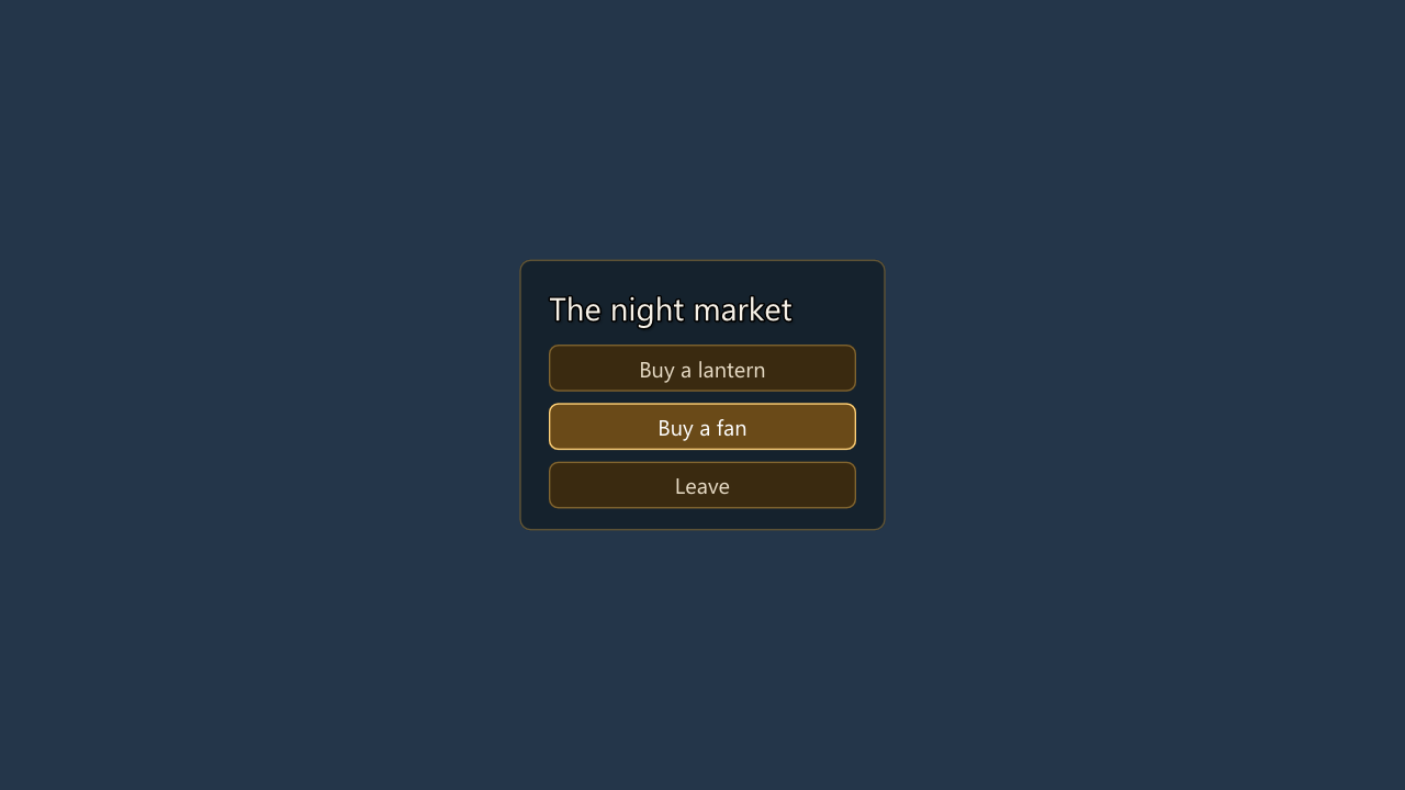
screen stall:
    style_prefix "gold"
    vbox style "card" align (0.5, 0.5) spacing 16:
        text "The night market" size 44 outline_width 2
        button "Buy a lantern" size (420, 64) return "lantern"
        button "Buy a fan" size (420, 64) text_color "#ffffff" return "fan"
        button "Leave" size (420, 64) close
The vbox draws with card, the buttons with gold_button because of the screen's prefix, and the second button's label is white whatever its state, because a property on the element itself is laid over every state of its style.
Characters
A character can give each part of its lines a look of its own. The parts are window (the dialogue window), namebox (the name tab), who (the name) and what (the line). On the character line:
window_style,namebox_style,who_styleandwhat_stylename a style for the part, used instead ofsay_window,namebox,say_labelandsay_dialoguefor this character's lines. A style made for this usually inherits from the built-in one, so it changes only what it lists.- A part's name joined to any style property sets that property on the part for this character alone, laid over the part's style:
what_size 40,what_outline_width 2,window_background "#200000",who_color "#ffff00",namebox_corner_radius 0.
style ghost_window is say_window:
    background "#10202cd0"
    border_color "#a8d8ff60"

style ghost_name is say_label:
    color "#a8d8ff"

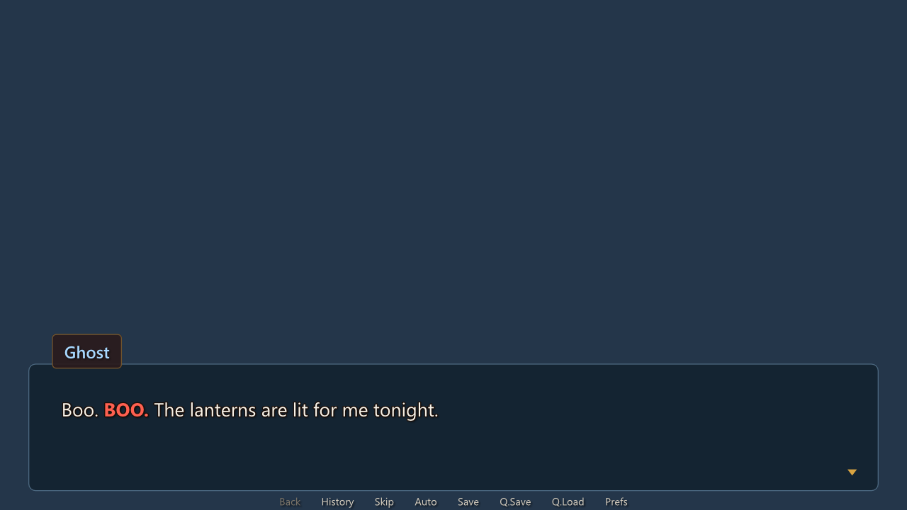
character ghost "Ghost" window_style "ghost_window" who_style "ghost_name" what_size 40 what_outline_width 2
character living "Living"
The ghost speaks in its own window with its name in its own colour and its line larger and outlined, and living keeps Novella's window.
 The older character options still work and still win where they say something:
 color colours the name unless the who style sets a colour of its own, and size, font and text_color (also spelled what_color) set the line's size, font and colour over its style.
Spans of a line
{style=name}...{/style} styles part of a line:
style shout:
    color "#ff6050"
    bold true

label start:
    ghost "Boo. {style=shout}BOO.{/style}"
A span takes only what its style sets: its font, size, color, bold or weight, outline and shadow, where the style or a parent other than default sets them. A style that only colours keeps the size and font of the line around it, so shout works in a ghost's 40-pixel line and in a narrator's 34-pixel one alike. Other text tags inside or around the span are laid over it, so {style=shout}{size=+10}BOO{/size}{/style} is larger still.
In the story builder
The story builder writes the same styles a script does. StoryBuilder.Style(name, s => ...) defines one with a StyleBuilder:
story.Style("gold_button", s => s
    .Is("button")
    .Background("#3a2a10")
    .When(StyleState.Hover, hover => hover.Background("#6a4a18").BorderColor("#ffd27a"))
    .BorderColor("#c8a05080")
    .CornerRadius(12));
story.Style("gold_button_text", s => s
    .Is("button_text")
    .Color("#e8dcc6")
    .When(StyleState.Hover, hover => hover.Color("#ffd27a")));
story.Style("say_dialogue", s => s.Outline(2, "#1a0f0a"));
story.Style("shout", s => s.Color("#ff6050").Bold());
StyleBuilder |
Sets |
|---|---|
Is(parent) |
The parent. |
Set(property, value) |
Any property by its script name: Set("line_spacing", 1.4), Set("padding", Value.FromList([32, 12])). A state-prefixed name (hover_color) is taken as it is. |
When(state, s => ...) |
Properties for one state: When(StyleState.Hover, h => h.Color("#ffd27a")) sets hover_color. The states are StyleState.Idle, Hover, Selected, Insensitive and Visited. |
Font(families), Size(size), Color(color), Bold(bold), TextAlign(alignment), Outline(width, color), Shadow(shadow, color) |
Text properties. |
Background(colorOrImage), Borders(left, top, right, bottom), BorderColor(color), CornerRadius(radius), Padding(left, top, right, bottom), BoxSize(width, height), Spacing(spacing) |
Box properties. |
A property's name is checked as it is set, so a misspelt one (Set("colour", ...)) throws at once rather than drawing nothing.
A character's parts take StoryBuilder.CharacterStyle(id, part, style, properties), after the character is defined:
story.Character("ghost", "Ghost")
    .CharacterStyle("ghost", "window", "ghost_window")
    .CharacterStyle("ghost", "who", properties: who => who.Color("#a8d8ff"))
    .CharacterStyle("ghost", "what", properties: what => what.Size(40).Outline(2, "#000000"));
On a ScreenBuilder, StylePrefix(prefix) is the screen's style_prefix; Style(name, prefix) gives the element added last a style, and a box a prefix for what it holds; and StyleProperty(property, value) sets a property on the element added last itself, text_ names styling a button's label:
story.Screen("stall", s => s
    .StylePrefix("gold")
    .VBox(v => v
        .Text("The night market", size: 44)
        .StyleProperty("outline_width", 2)
        .Button("Buy a lantern", ScreenActions.Return("lantern"))
        .Button("Buy a fan", ScreenActions.Return("fan"))
        .StyleProperty("text_color", "#ffffff")
        .Button("Leave", ScreenActions.Hide()), spacing: 16)
    .Align(0.5, 0.5)
    .Style("card"));
ScriptWriter.WriteStyle prints a style as its script block, and a story written with the builder prints and reads back as the same script.
In Divooka
The Styles category of the Novella toolbox builds a style a node at a time, as the other functional nodes build a story:
Start Style (
gold_button, parentbutton) → Set Style Property (background,"#3a2a10") → Set Style Property (background,"#6a4a18", statehover) → Set Style Property (corner_radius,12) → Add Style into a story
A value is typed as a script writes it: "#ffd27a" with its quotes for a colour, 40 for a size, (24, 12) for edges, true, center. Style To Script shows the style as script, and Built-in Style Names lists the styles a story can restyle. On a screen, Set Screen Style Prefix, Style Last Element (a style, and for a box a prefix) and Set Last Element Style Property do what style_prefix, style and a property on an element do in a script. On a character, Character Part Style names a part's style and Set Character Style Property sets a property on a part, both in the Characters category. Each checks the property's name as it is set.
What the validator reports
The lint (NovellaPlayer lint, the console's lint, Check Story and Check Game) reads every style and every place one is named:
- a parent that is not a style, built-in or the story's own;
- a circle of parents (
loop_a is loop_b,loop_b is loop_a), as an error; - a property Novella does not know, on a style, a character's part or a screen's element;
- a value of the wrong kind: a colour not written
"#rrggbb"or"#rrggbbaa", a word where a number belongs, edges that are not one, two or four numbers, atext_alignother thanleft,centerorright, aweightother than the four, a value that is not a constant; - a background or image that is neither a colour,
none, an image the story defines nor a file of the game, and a sound that is not among its files; - a style named but not defined: by a screen's
style, by a character'swindow_styleand the rest, or by a{style=name}span.
The last matters most, because a misspelt style name is otherwise silent: the element just draws with its default look.
Differences from Ren'Py
Novella's styles follow Ren'Py's model, parents and state prefixes and style_prefix included, and add the visited_ state for choices taken in an earlier playthrough. Not supported:
- compound prefixes such as
selected_hover_orselected_idle_; an element in several states takes the first of them that a style sets, in the order above; - displayables as backgrounds beyond a colour or a nine-patch picture: no
Frame(...),Solid(...)or composed displayable; - changing a style while the game runs (
style.button.background = ...in Python,style.rebuild()); styles are definitions, read when the game starts or the scripts reload; - the
{=style}spelling of a span; write{style=name}.
The property set is Novella's own, listed above: Ren'Py's outlines list is outline_width and outline_color, xalign-style numbers for text are text_align left|center|right, and xpadding or left_padding are the edges of padding. A Ren'Py property with no Novella counterpart is reported by the validator as unknown. Ren'Py's gui variables have their counterpart in the theme, whose keys are shorthands for the built-in styles in the same way.