
Adjustments
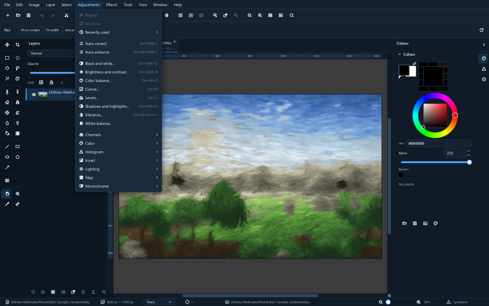
Adjustments change the colours and tones that are already in the picture. The menu holds about forty of them. Start with the tonal and colour controls below, then explore according to your subject.
Many corrections can also be made as an adjustment layer. Check Layer ▸ New adjustment layer for the available kinds; use a duplicate pixel layer for corrections not offered there. This page is about what each correction does; that page is about making it reversible.
Reading the histogram first
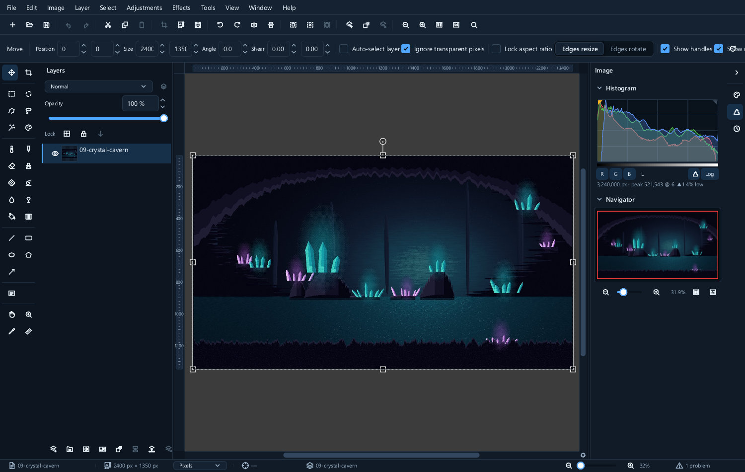
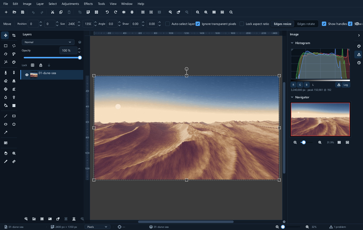
The histogram counts how many pixels the picture has at each brightness — black at the left, white at the right, and the height of the graph at any point is how many pixels are that bright.
Read it alongside the picture: it describes tonal distribution, not whether the exposure is right.
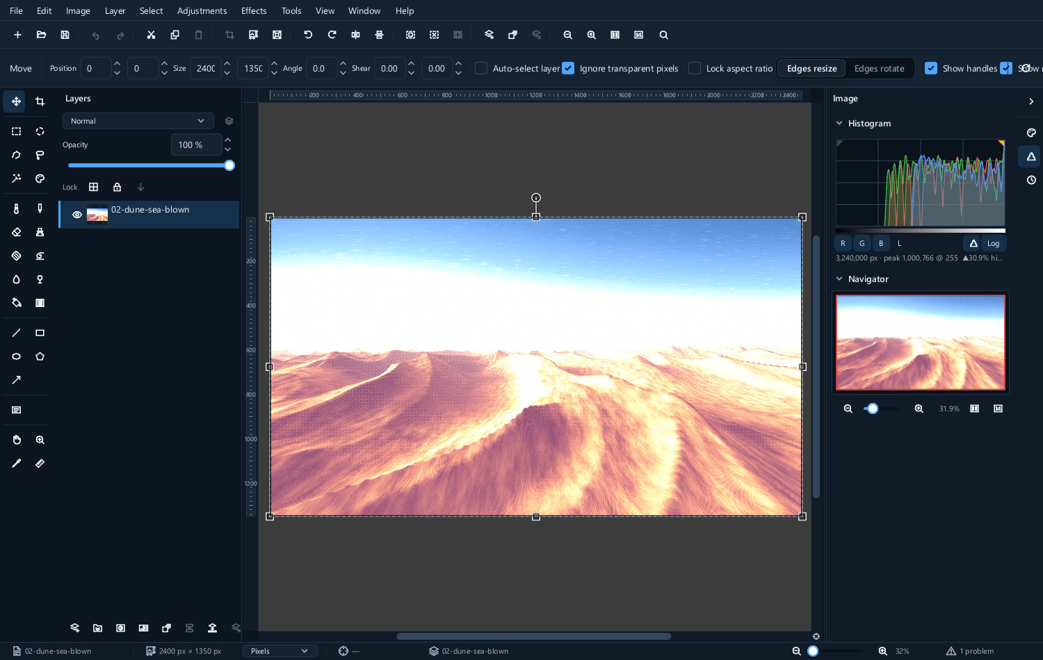
| A dark picture | A well-spread picture | A clipped picture |
|---|---|---|
 |
 |
 |
- Bunched to the left — mostly dark tones; a night scene may be correct this way.
- Bunched to the right — mostly bright tones; snow or a white background may explain it.
- A gap at an end — a limited tonal range, which may suit mist or a deliberately soft image.
- A spike at an edge — investigate clipping, but also check for intentional solid backgrounds and specular highlights. Inspect individual colour channels: a combined histogram can hide a clipped channel. Detail absent from the source cannot be recovered by lowering brightness.
For background on tonal distribution and image key, see Adobe’s histogram explanation. Its interface instructions describe Photoshop; use this guide’s menu paths here.
Tones
Levels
Adjustments ▸ Levels... is the first tool to reach for. Three sliders sit under the histogram: black point, grey point, white point.
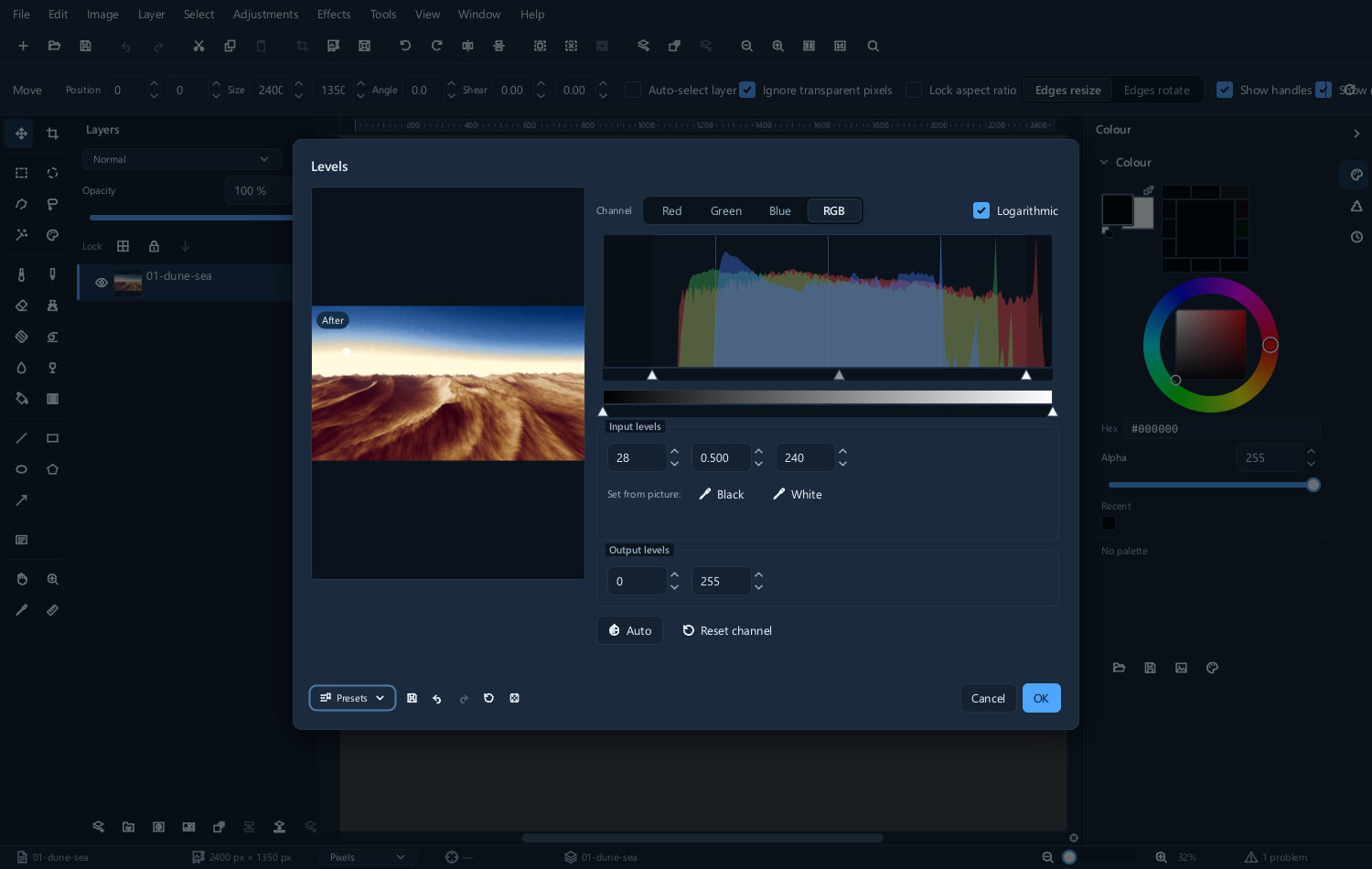
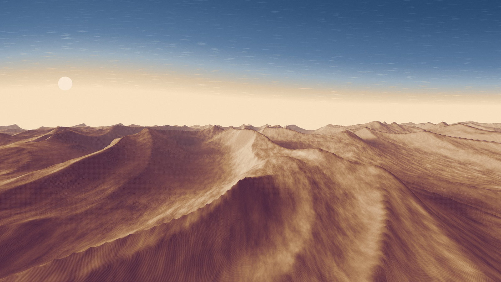
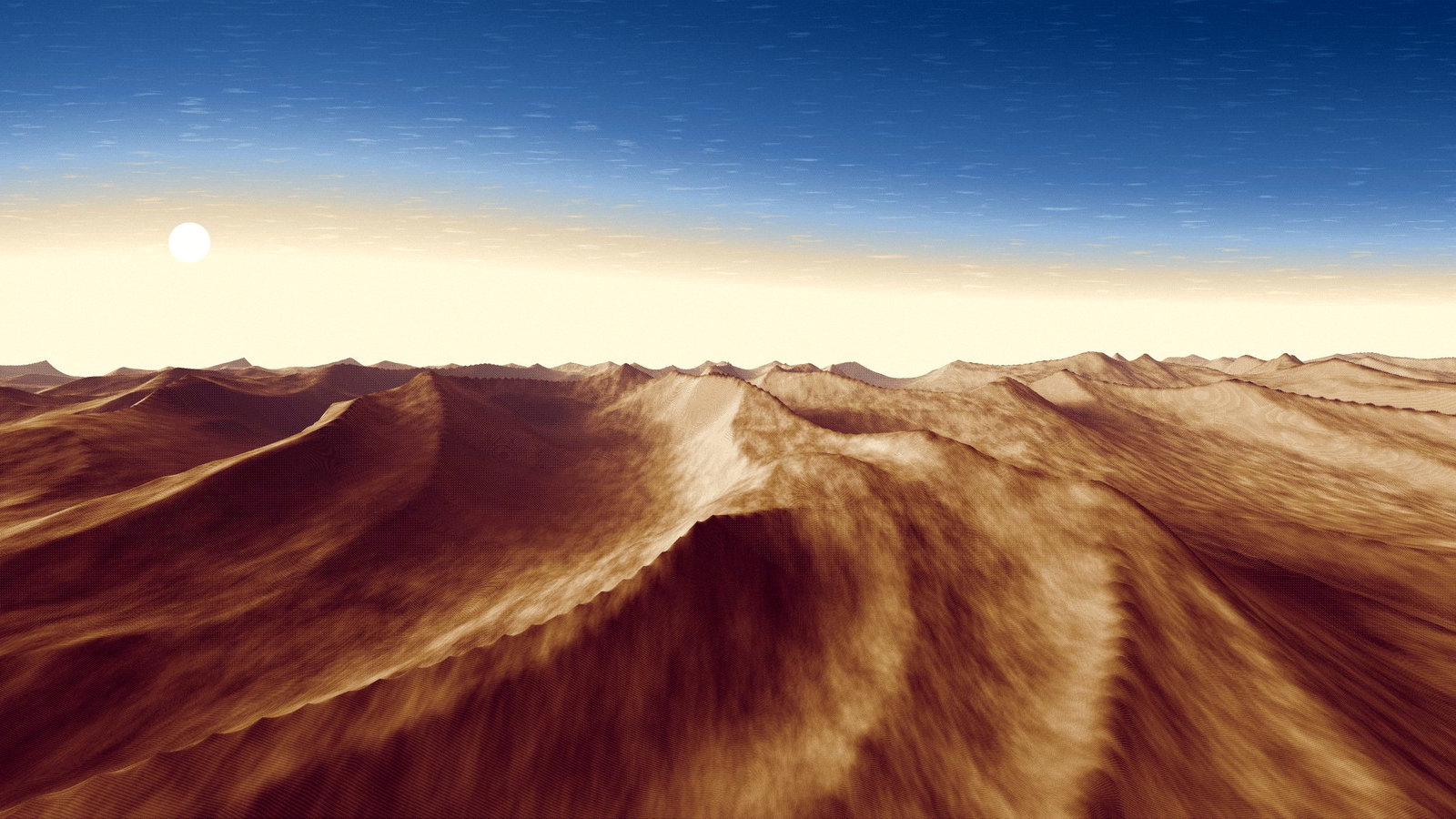
For a flat picture that needs stronger contrast, move the black and white points inward while watching important detail. Mapping the data’s ends to black and white spreads the range, but can remove the atmosphere of a deliberately low-contrast picture.
| Before | After |
|---|---|
 |
 |
The middle slider is the grey point. It brightens or darkens the mid-tones and leaves both ends where they are — the control you want when a picture is correctly exposed overall but too dark in the middle.
Moving a point into the data clips that part of the result. You can change a live adjustment again, or undo a pixel edit while its history remains. Clipping already present in the source is a different problem: the missing detail is unavailable.
Curves
Curves... does everything Levels does and more, at the cost of being less obvious.
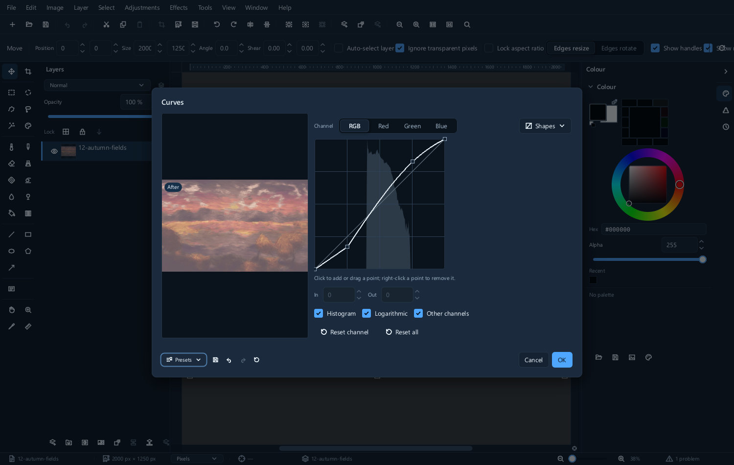
The line maps input brightness to output brightness. Where the line is above the diagonal the picture gets brighter; below, darker. The steeper the line, the more contrast in that part of the range.
Two shapes cover most uses:
- A gentle S — pull the shadows down a little and the highlights up a little. This adds contrast where the eye notices it and is the standard photographic curve.
- A single point raised in the middle — brightens without touching the ends.
| Before | After a gentle S curve |
|---|---|
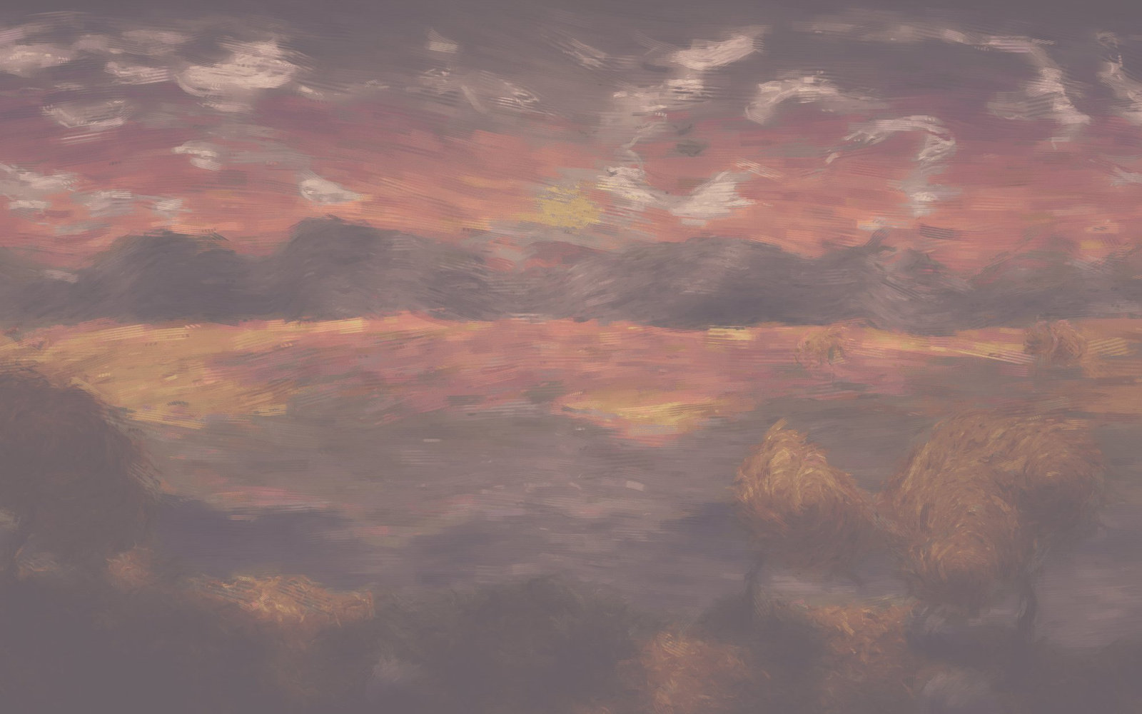 |
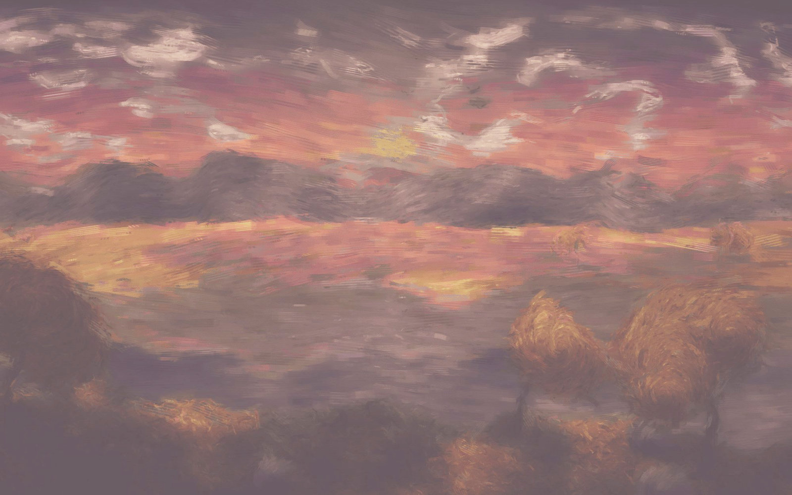 |
Click the line to add a point, drag a point to move it, right-click one to remove it. The channel tabs let you curve red, green and blue separately, which is a colour correction rather than a tonal one.
Keep the number of points small. Two or three make a smooth curve; eight make a lumpy one, and the lumps show as banding in skies.
Exposure
Exposure... works in stops, like a camera. One stop is a doubling or halving of light.
| Before | After | The dialog |
|---|---|---|
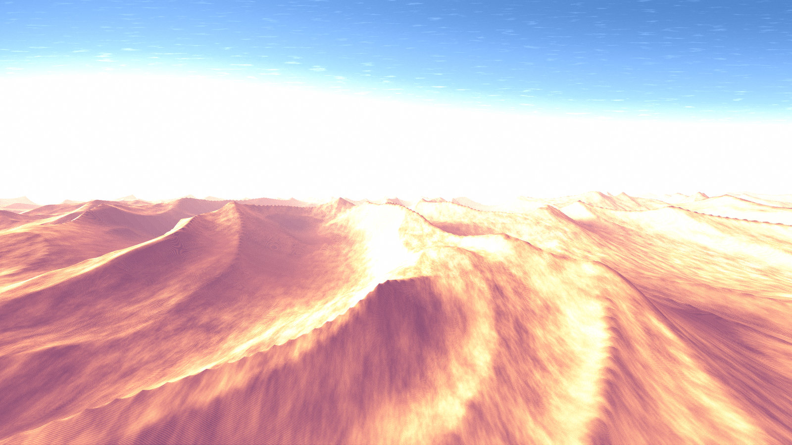 |
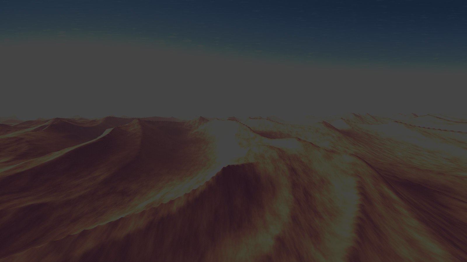 |
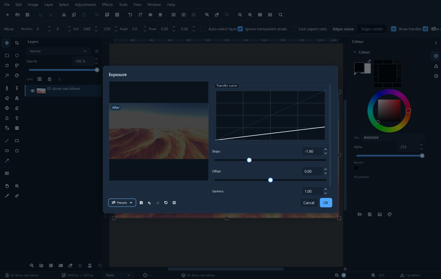 |
These exaggerated examples show the direction of an exposure change, not a target exposure or proof of recovered highlights. Choose the setting by the subject and the detail actually available.
Use it when the whole picture is too dark or too bright. Use Levels or Curves when only part of the range is wrong.
Brightness and contrast
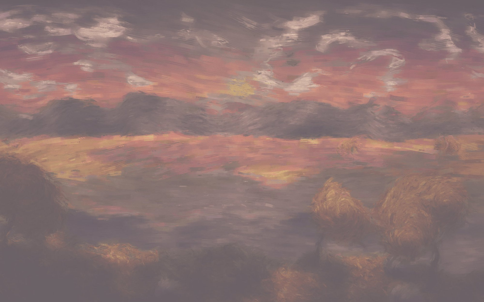
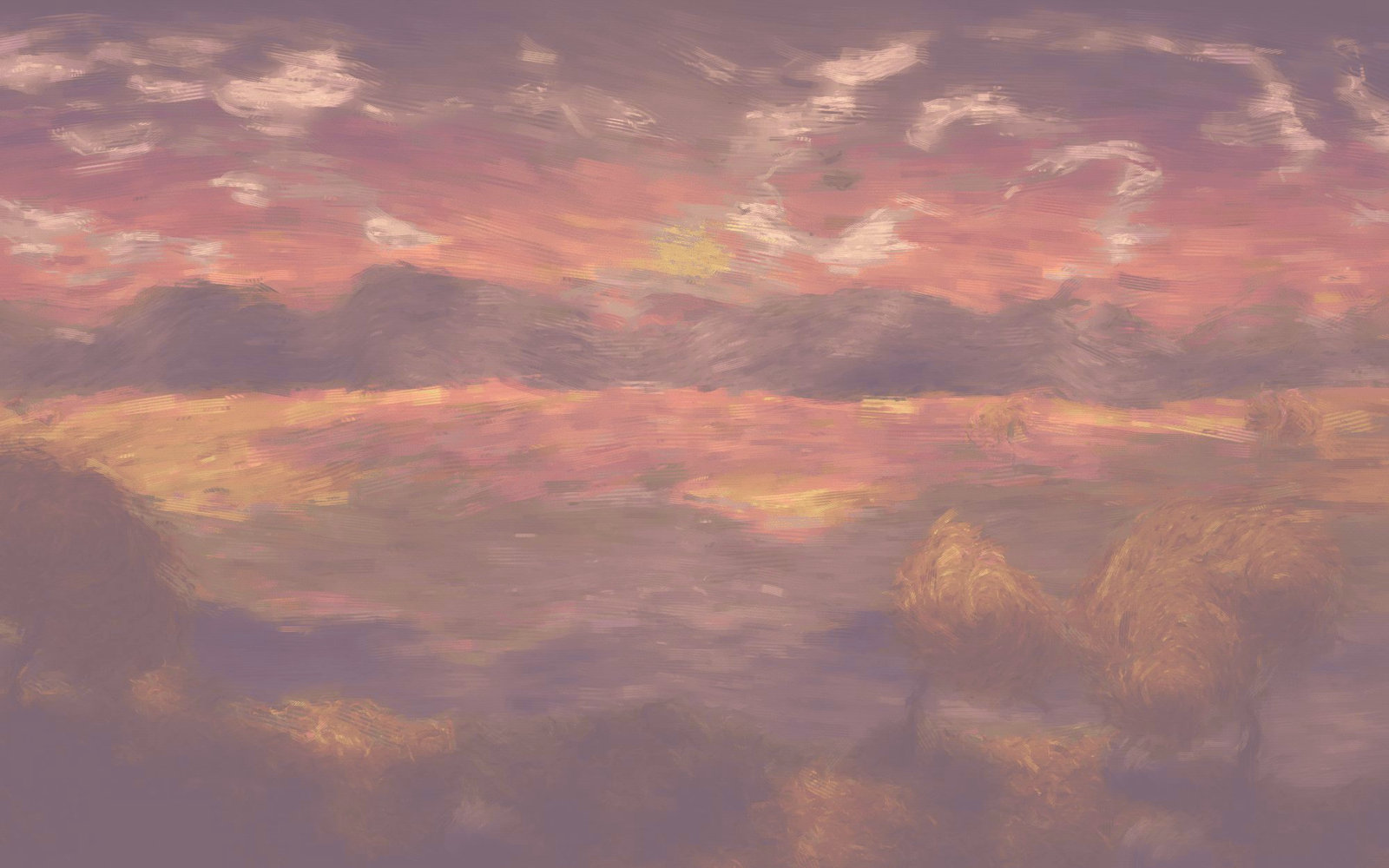
Brightness and contrast... is the blunt instrument, and it is the one most likely to clip detail off both ends. It is fine for a small nudge and a poor choice for a real correction.
| Before | After |
|---|---|
 |
 |
Shadows and highlights
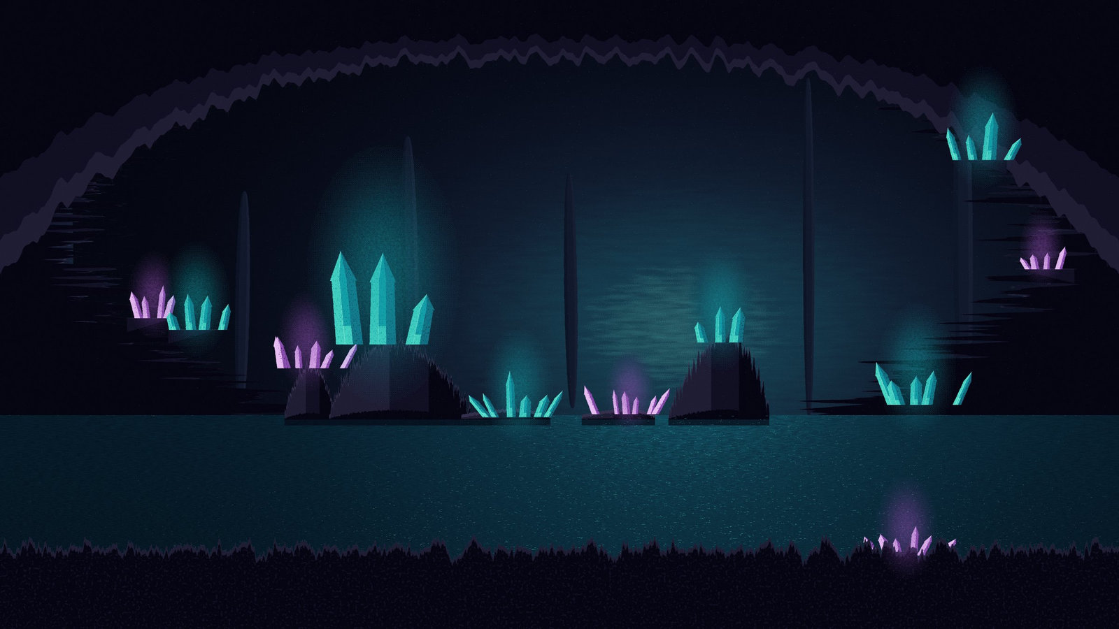
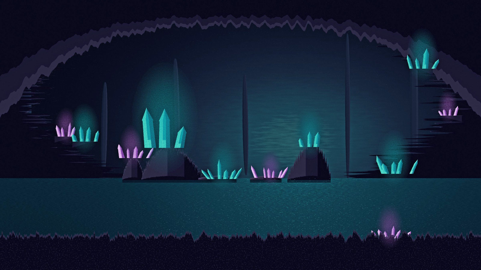
Shadows and highlights... targets dark and bright regions while limiting changes to the midtones. It can reveal existing detail, but cannot reconstruct information clipped in the source. It is the right answer to a picture with a bright sky and a dark foreground — the situation that defeats every global adjustment.
| Before | After |
|---|---|
 |
 |
Push it too far and the picture goes flat and slightly unreal. Small amounts do a lot.
Colour
White balance
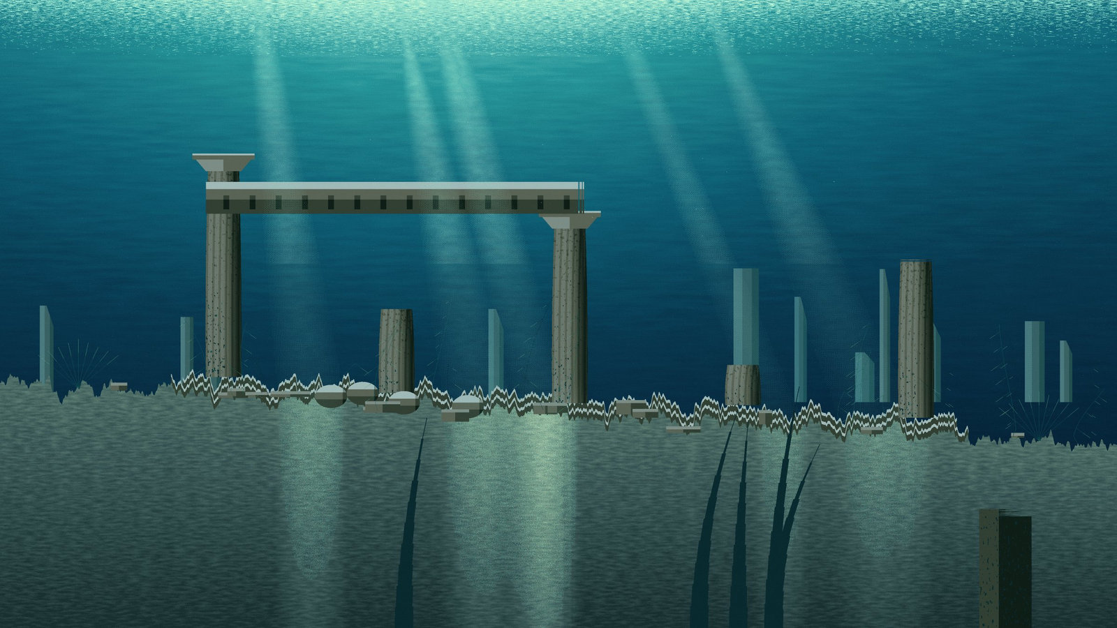
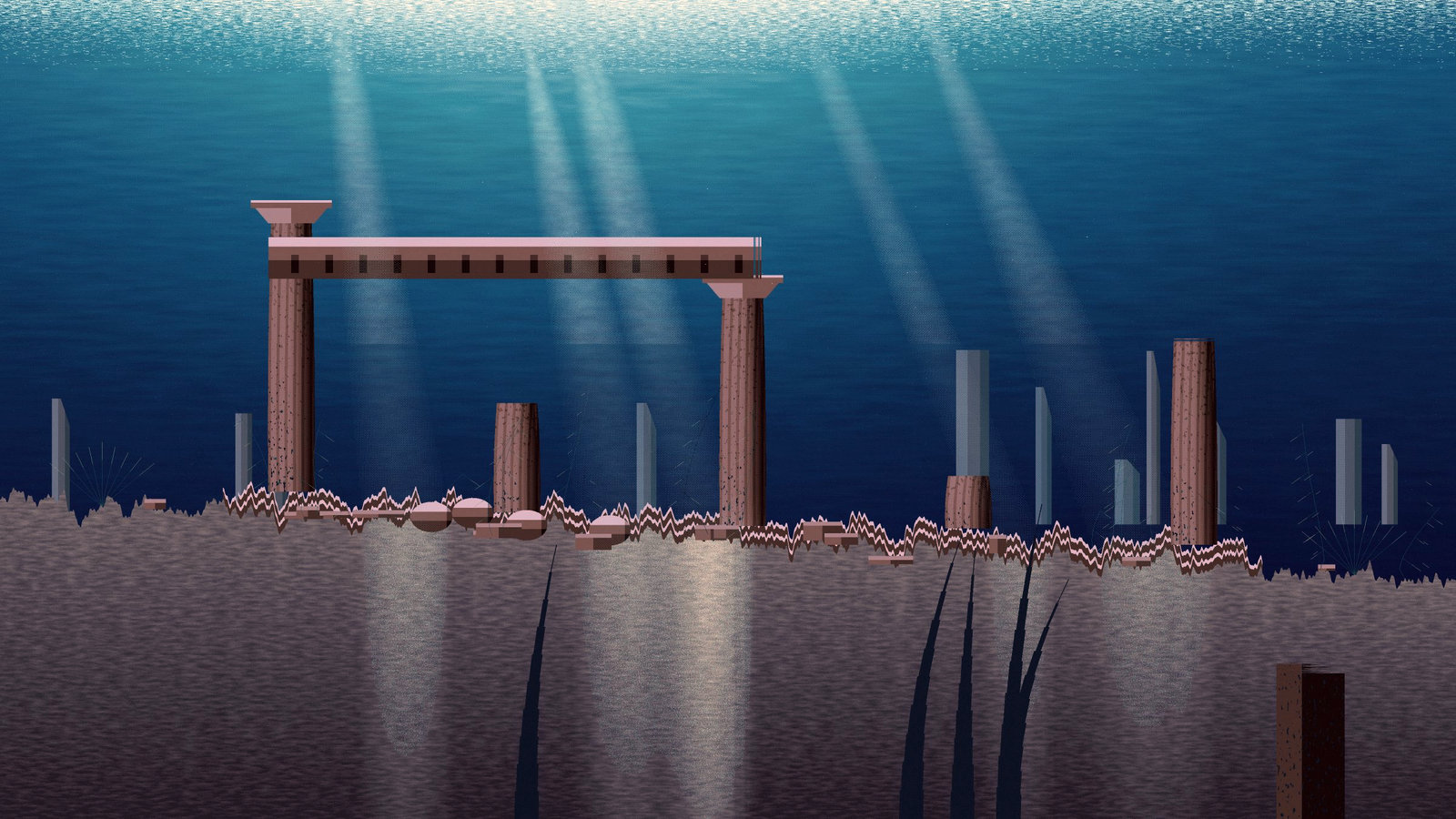
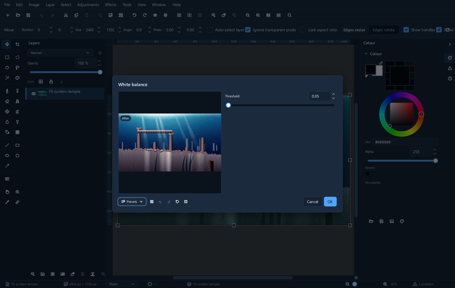
A photograph taken under tungsten light is orange; one in shade is blue. White balance... removes the cast by deciding what in the picture ought to be neutral.
| Before | After | The dialog |
|---|---|---|
 |
 |
 |
Temperature... does the same thing by hand, on a warm-to-cool axis. Use it when the automatic correction is technically right and looks wrong — a sunset corrected to neutral stops being a sunset.
Hue, saturation and vibrance
Hue and saturation... has three controls.
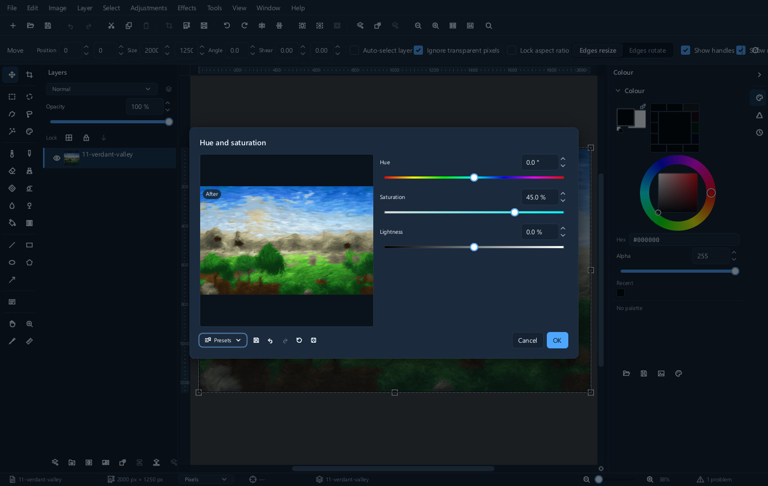
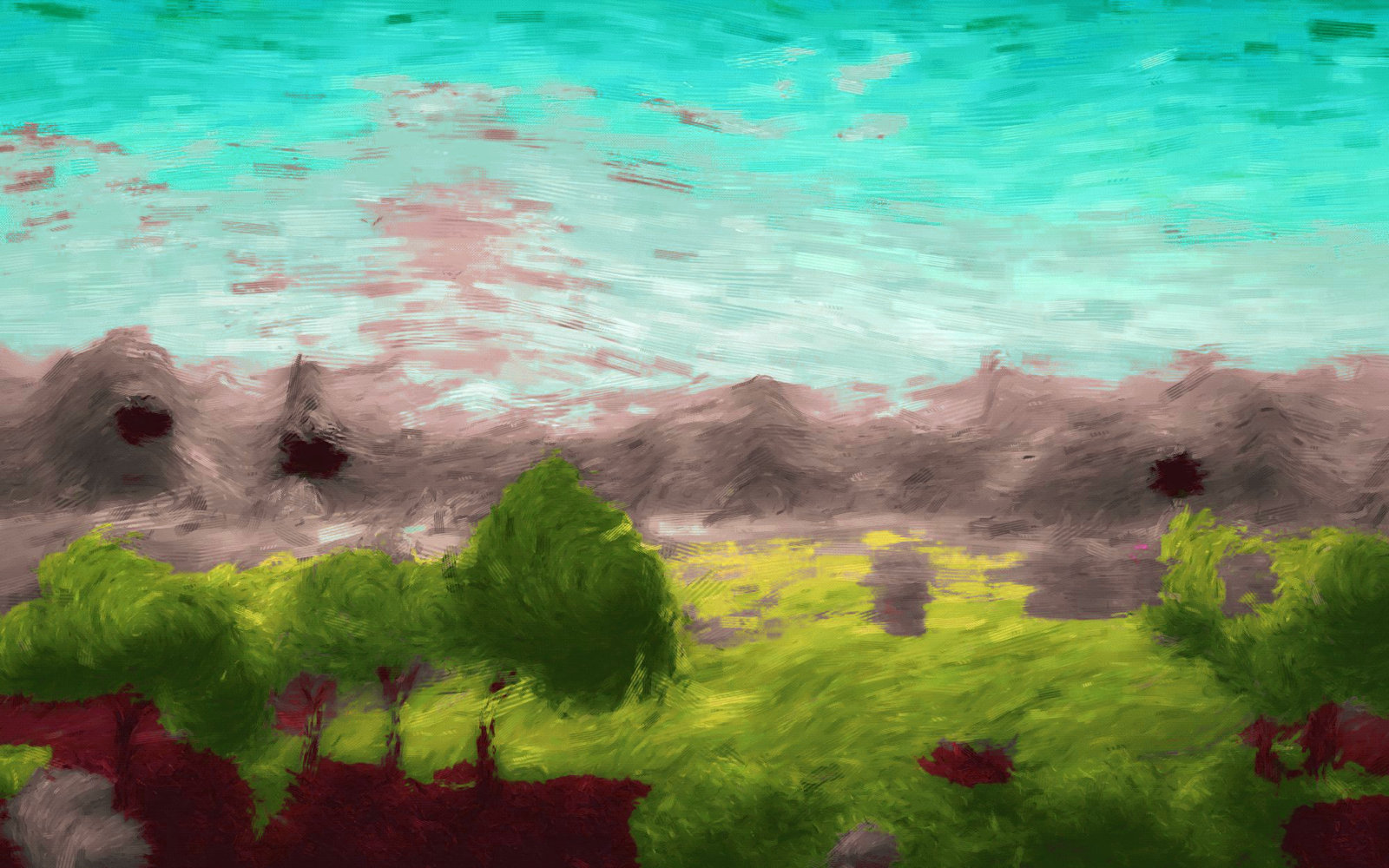
- Hue rotates every colour around the wheel. Large shifts are an effect, not a correction.
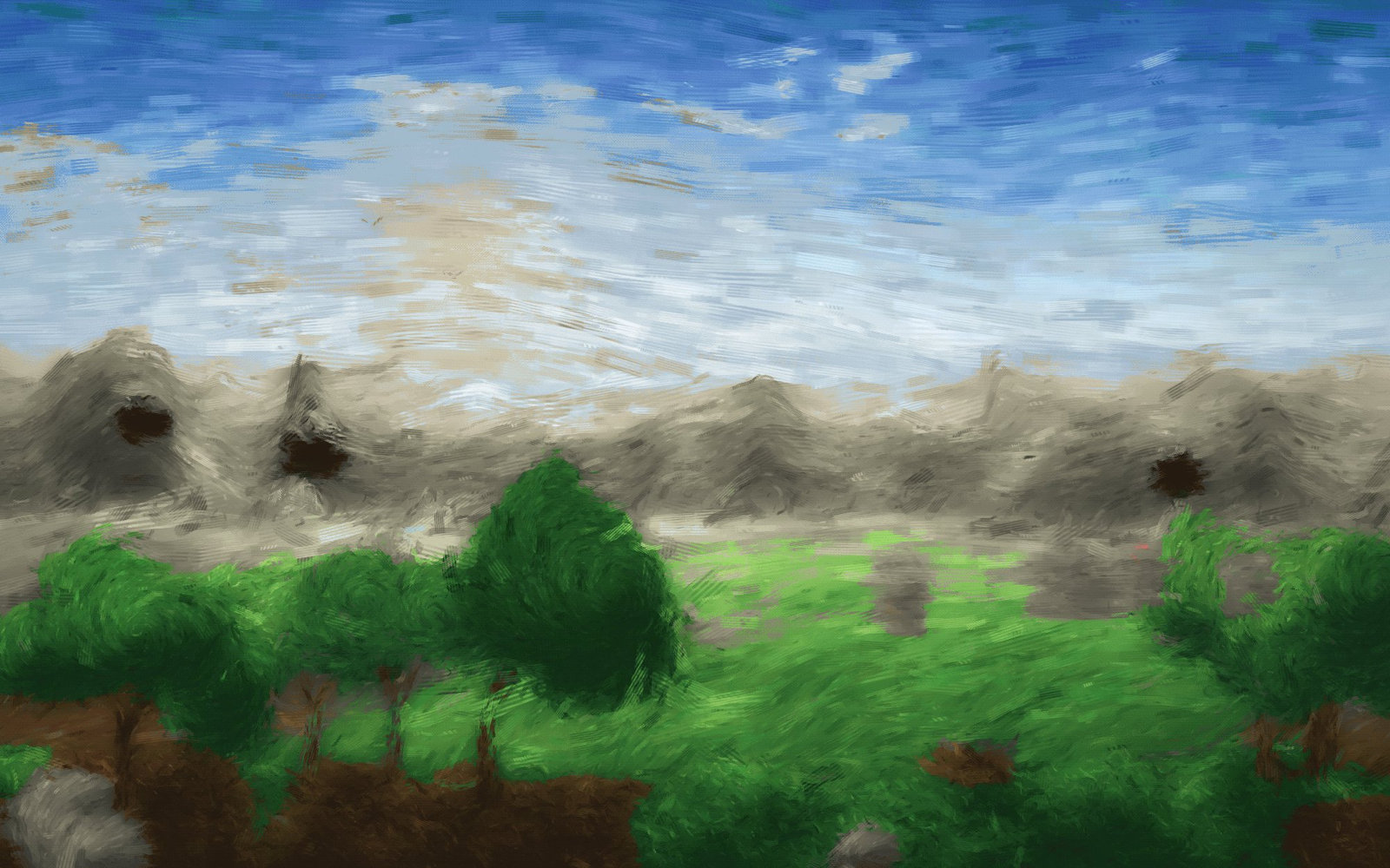
- Saturation makes colours more or less intense. It affects all colours equally, so pushing it up turns already-strong colours into flat blocks.
- Lightness brightens or darkens.
| Original | Hue shifted | Saturation raised |
|---|---|---|
 |
 |
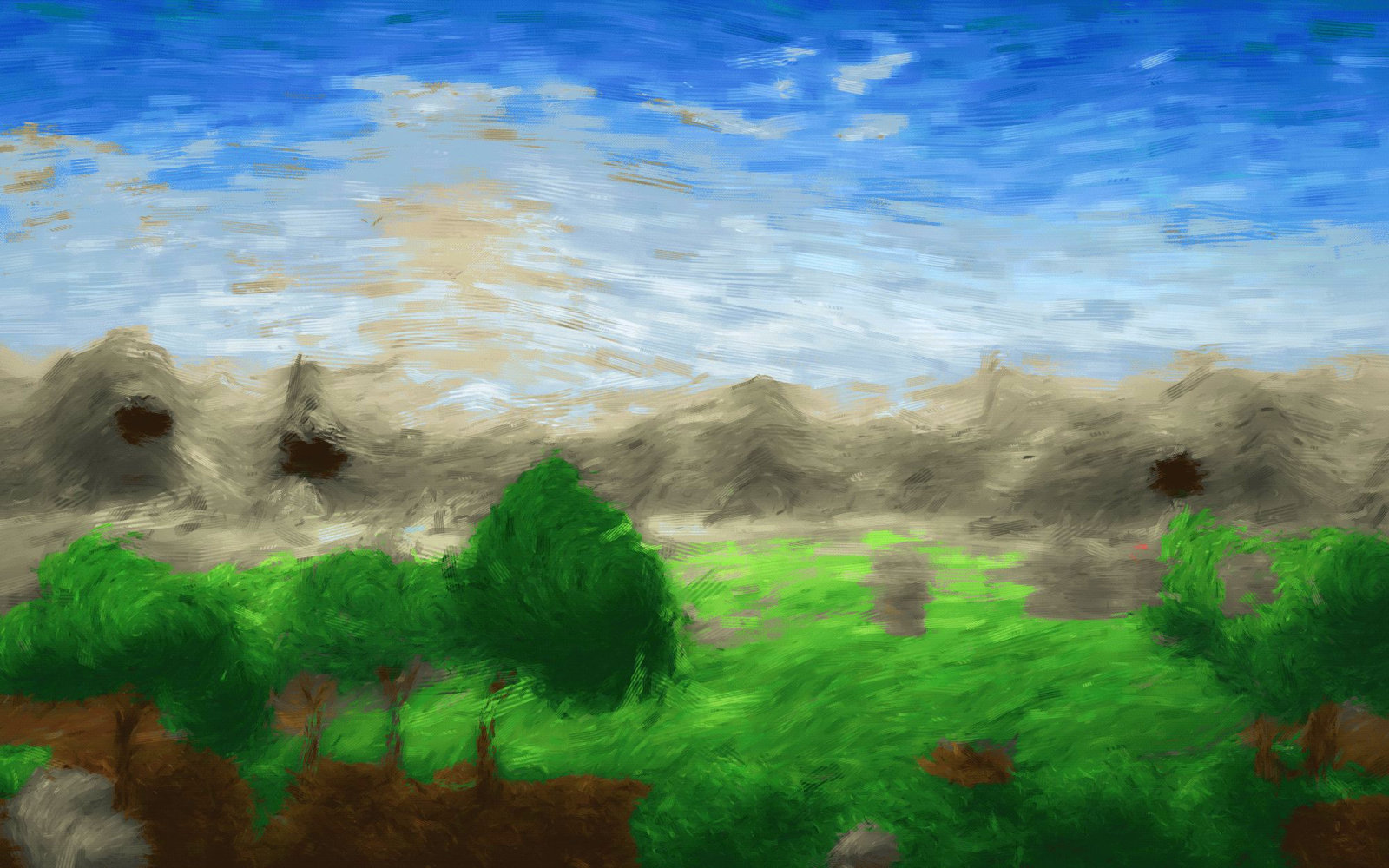 |
Vibrance... is the one to use instead. It raises the intensity of muted colours and leaves already-saturated ones alone, so it strengthens a landscape without turning skin orange.
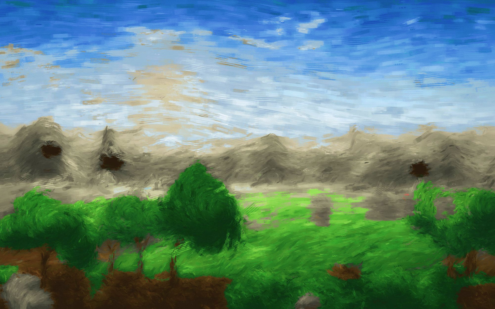
If you are reaching for Saturation, try Vibrance first.
Colour balance
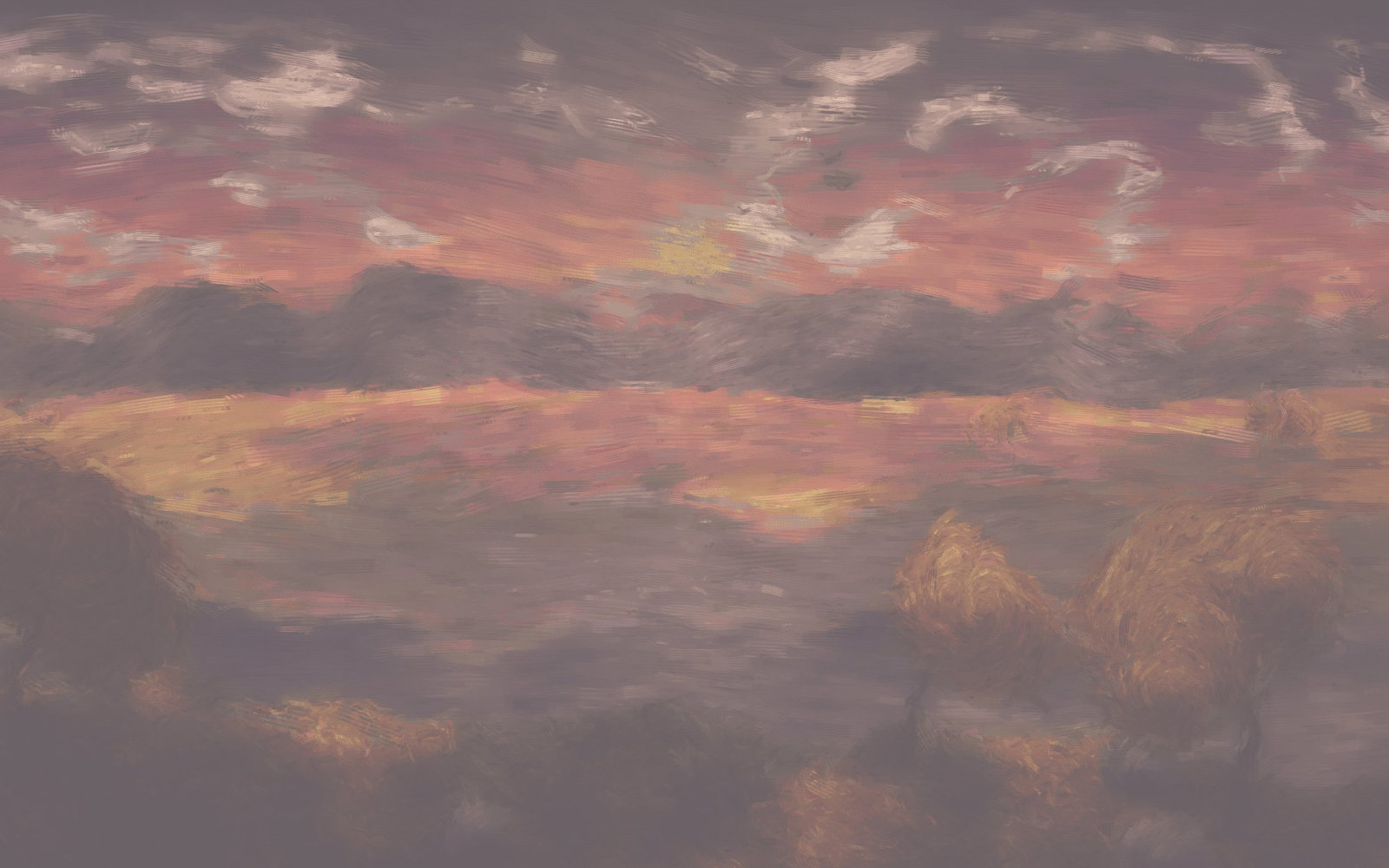
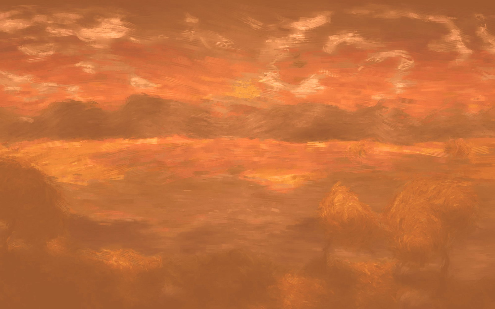
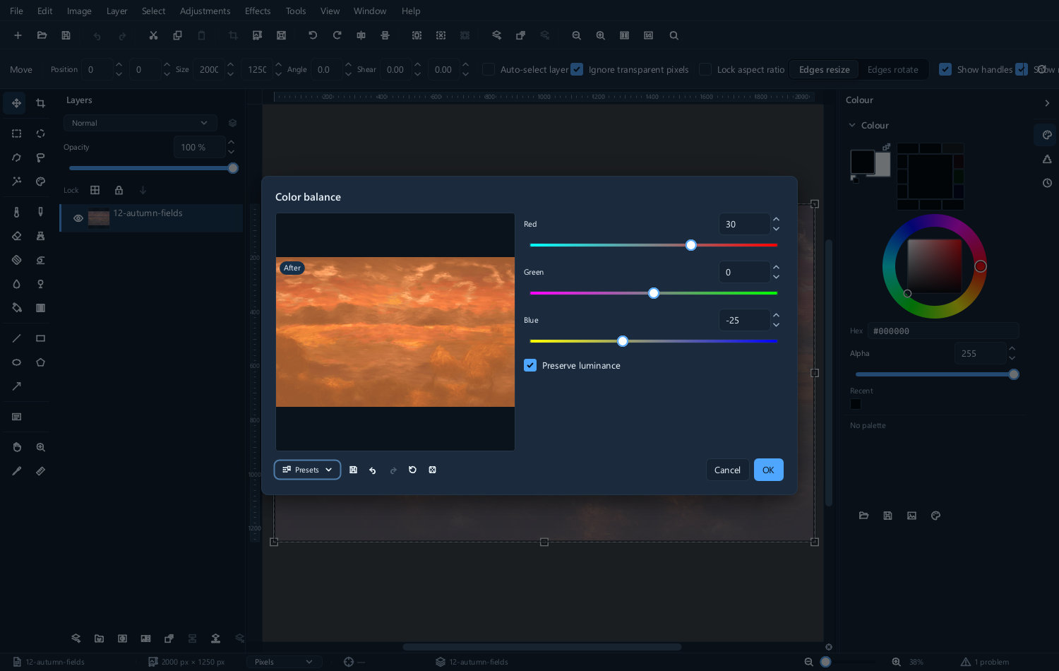
Color balance... shifts colour separately in the shadows, mid-tones and highlights. It is how you fix a picture whose shadows are blue and whose highlights are fine, and how film-style grades are built.
| Before | After | The dialog |
|---|---|---|
 |
 |
 |
Black and white
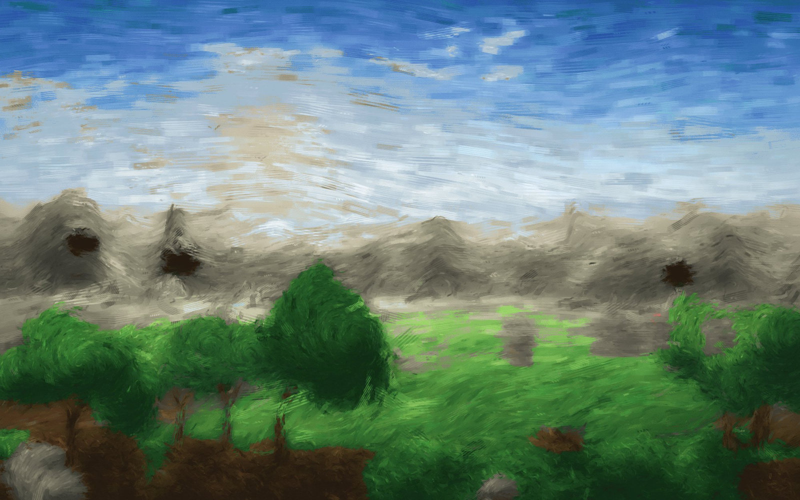
Converting to monochrome by removing the colour is the worst way to do it — red and green of the same brightness become identical grey, and the picture loses its separation.
Color to monochrome... lets you say how much each colour channel contributes, which is the digital equivalent of a photographer's coloured filter.
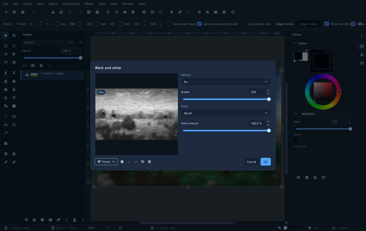
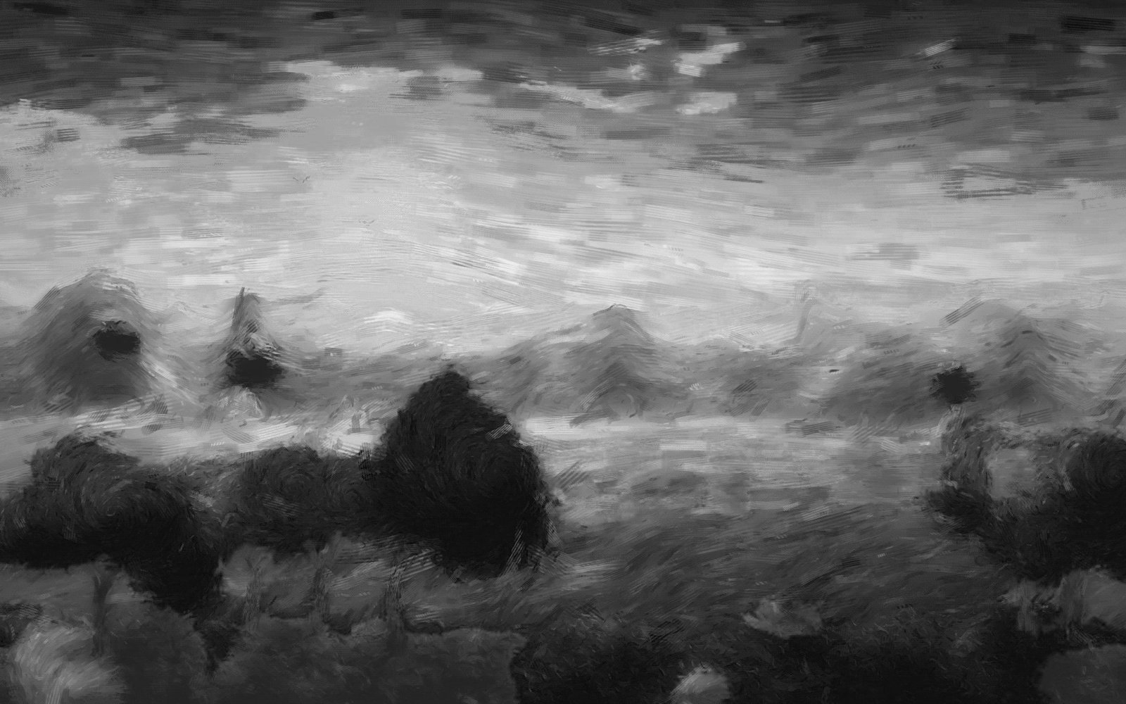
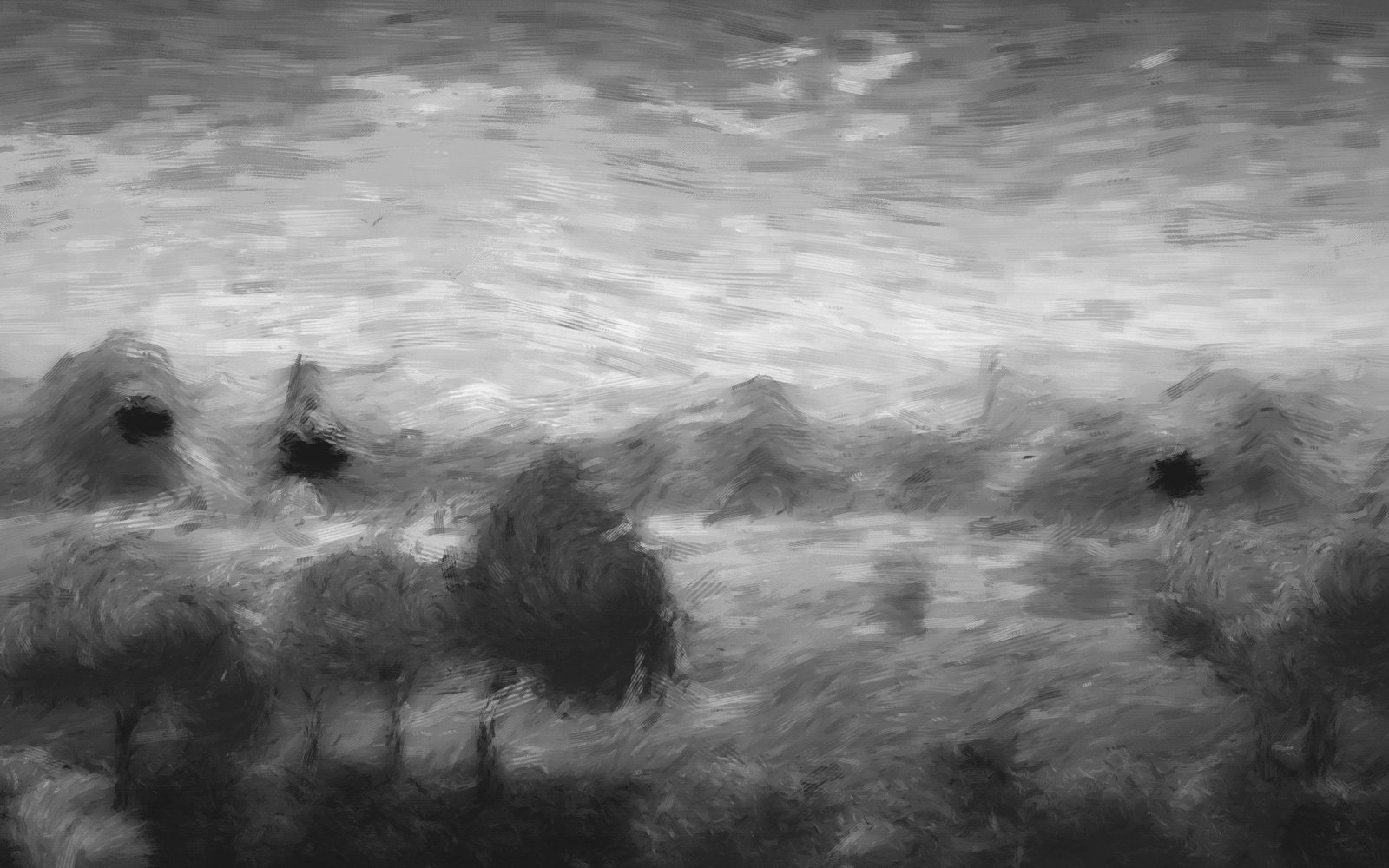
| Colour original | Weighted to red | Weighted to blue |
|---|---|---|
 |
 |
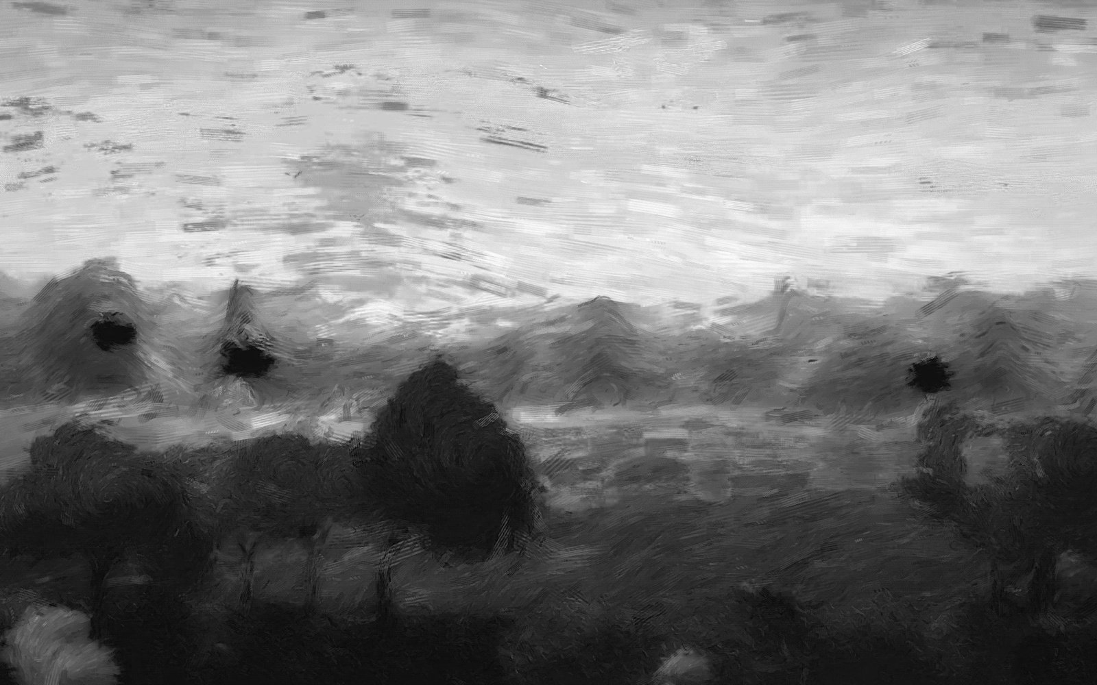 |
The difference is large. Weighting towards red lightens skin and warm ground; weighting towards blue darkens them and dramatises a sky.
The standard broadcast weighting is a safe default when you have no particular intent.
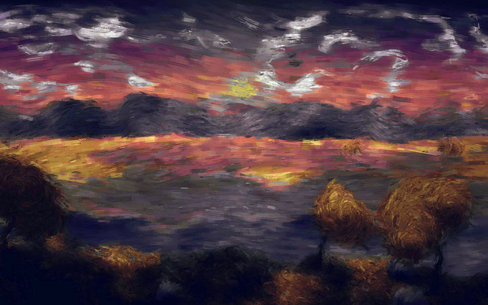
Sepia... and Split toning... put colour back into a monochrome picture — one tone throughout, or different tones in the shadows and highlights.
The automatic ones
Auto correct and Auto enhance analyse the picture and apply what they think it needs.
They are a reasonable starting point and a poor finishing point. Use one, look at the histogram, and correct from there. If the result is worse, undo it — they have no way of knowing what you intended the picture to look like.
The rest of the menu
| Submenu | Holds |
|---|---|
| Channels | Mixing, rechannelling, shifting and taking the maximum or minimum channel |
| Color | Colorize, replace colour, selective colour, photo filter, gradient map, colour lookup |
| Histogram | Display, equalise and stretch |
| Invert | RGB, hue, and CMYK film negative |
| Lighting | Exposure, gamma, dehaze, HDR, shadows and highlights |
| Map | Palette map and colour lookup tables |
| Monochrome | Black and white, threshold, and monochrome back to grey |
Threshold... reduces the picture to pure black and white at a cutoff you choose — useful for making a mask from a high-contrast picture.
Gradient map... replaces the brightness range with a gradient, which is how duotones and a lot of poster styling are made.
An order that works
- Exposure — get the overall brightness right
- Levels or Curves — spread the tones across the range
- White balance — remove any colour cast
- Shadows and highlights — recover the ends if they need it
- Vibrance — strengthen colour last, once everything else is settled
Doing colour before tone means redoing the colour, because changing the tones changes how the colours look.
Next
- Adjustment layers — making all of this reversible
- Colour management — why colours differ between programs
- Effects — changing the picture rather than correcting it